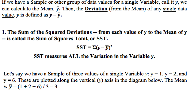
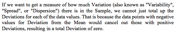
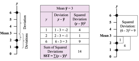
|
The concept of Null Hypothesis can be confusing for many of us. It is a statement of nonexistence, For example: "There is no (Statistically Significant) difference between the Means of these two Populations." And we normally think in terms of what exists, not what doesn't. It would be more natural for most of us to start by asking a question instead: "Is there a (Statistically Significant) difference between the Means of these two Populations?" Then, we could rephrase it as a Negative Statement to produce a Null Hypothesis, as shown below. 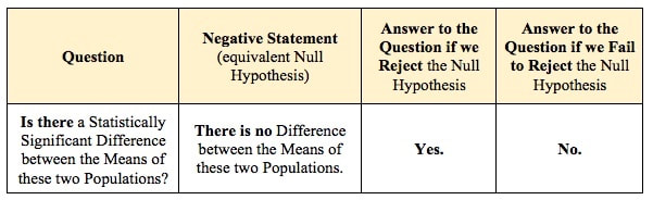 For more on this, view the videos:
0 Comments
In our Statistics Tip of the Week for April 6, 2017, we described the difference between Common Cause Variation in a process and Special Cause Variation. Common Cause Variation is like random noise in a process that is under control. Special Cause Variation comes from external factors outside the process, like the effect that the ambient temperature in a factory rising through most of the workday has on a chemical reaction. This type of factor is sometimes called a "Nuisance Factor" in the discipline of Design of Experiments. And, we said that any Special Cause Variation must be eliminated before one can attempt to narrow the range of Common Cause Variation. Narrowing the range of Common Cause Variation is a major objective of process improvement disciplines like Six Sigma. Factors -- the inputs -- are denoted by x's, and y is the output -- also known as the Response. Briefly, statistical software for Design of Experiments can provide us the number of trials ("Runs") to do and the levels of x for each trial. We might get test results that look like the following. (There is a lot to explain here, more than we can cover in this blog post). 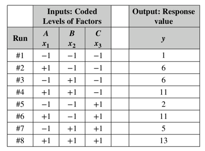 Our Tip for April 12, 2018 said that Designed Experiments, together with Regression Analysis, can provide strong evidence of Causation. When we're doing these experiments, we are often not able to easily get rid of the Special Cause (Nuisance Factor) Variation, but we can try to reduce or eliminate its effect on the experiment.
A known Nuisance Factor can often be Blocked. To “Block” in this context means to group into a Block. By so doing, we try to remove the effect of Variation of the Nuisance Factor. In this example, we Block the effect of the daily rise in ambient temperature by performing all our experimental Runs within a narrow Block of time. And, if it takes several days to complete all the Runs, we do them all at a similar time of day in order to have the same ambient temperature. We thus minimize the the Variation in y caused by the Nuisance Factor. There can also be Factors affecting y which we don’t know about. Obviously, we can’t Block what we don’t know. But we can often avoid the influence of Unknown Factors (also known as “Lurking” Variables) by Randomizing the order in which the experimental combinations are tested. For example – unbeknownst to us – the worker performing the steps in a process may get tired over time, or, conversely, they might “get in a groove” and perform better over time. So, we need to Randomize the order in which we test the combinations of Factors. Statistical software can provide us with the random sequences to use in the experiment. Statistics Tip of the Week: Always plot the data first; statistics alone can be misleading.3/21/2018 It has been said that the first three laws of statistics are:
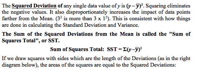
Statistics alone can be misleading. The human mind did not evolve to understand concepts by reading words and numbers on a page. It is much more visual. Pictures can help give us an intuitive understanding that words and numbers cannot. Here's an example. We're trying to determine if there is Correlation between the x and y values for either of the two Samples of data pictured below. 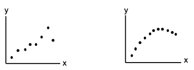 We calculate a Statistic for each Sample, r, the Correlation Coefficient. The value of r for these two plots are almost identical – and in both cases, it indicates a very strong Linear Correlation.
That makes sense for the one on the left. However, the one on the right is not linear at all. That data would more likely to be approximated by a polynomial curve. Residuals represent the Error in a Regression Model. They represent the Variation in the y variable which is not explained by the Regression Model. A Residual is the difference between a given y value in the data and the y value predicted by the Model. Residuals must be Random. There are several kinds of non-Randomness to look for. One is unexplained Outliers. And a Box and Whiskers Plot like the one shown below can be used to identify them. 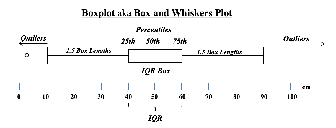 The Interquartile Range (IQR) box shows the Range of the values around the Mean which comprise 50% of the total values. In this example, the IQR is 60 - 40 = 20. Horizontal "whiskers" are drawn to extend 1.5 box-lengths on either side of the box.
Outliers are defined as those Residuals beyond these "whiskers". These graphs show the difference between a Distribution that has a Discrete data and a Discrete stairstep Probability graph compared to a Distribution with Continuous data and a Continuous smooth curve. 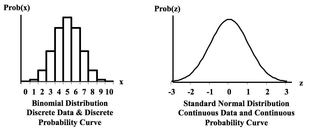 For the Discrete data Distribution, the values of the Variable X can only be non-negative integers, because they are Counts. There is no Probability shown for 1.5, for example, because 1.5 is not an integer, and so it is not a legitimate value for X. The Probabilities for Discrete data Distribution are shown as separate columns. There is nothing between the columns, because there are no values on the horizontal axis between the individual integers. For Continuous Distributions, values of horizontal-axis Variable are real numbers, and there are an infinite number of them between any two integers. Continuous data are also called Measurement data; examples are length, weight, pressure, etc. The Probabilities for Continuous Distributions are infinitesimal points on smooth curves. 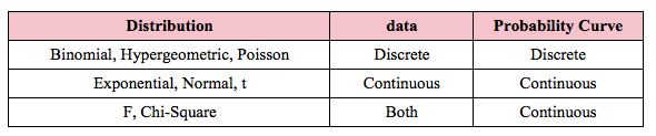 For the first six Distributions described in the table above, the data used to create the values on the horizontal axis come from a single Sample or Population or Process. And the data are either Discrete or Continuous. The F and Chi-Square (𝜒2) Distributions are hybrids. Their horizontal axis Variable is calculated from a ratio of two numbers, and the source data don’t have to be one type or another. Being a ratio, the horizontal axis Variable (F or 𝜒2) is Continuous. The Probability curve is smooth and Continuous.
For more, see my YouTube video Probability Distributions -- Part 1 (of 3): What They Are. There are also videos on the F Distribution and the Chi-Square Distribution. See the Videos page of this website for the latest status of available and planned videos. In our Tip of the Week for Jan 25, 2018, we described Sum of Squares Within (SSW) as a measure of Variation in a group (sample, population or process) of data values. In ANOVA, Sum of Squares Between (SSB) is used together with SSW to determine whether there is a Statistically Significant difference among the Means of several groups. Here's a conceptual illustration of Variation Within and Between groups. Each bell-shaped curve represents a group. The widths of the curves represent how much variation there is within each. That is what SSW represents. 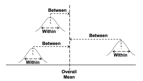 For the variation between Means, we calculate the differences between the Means of each group and the Overall Mean. Then, we square those differences and then we sum those squares. This gives us the Sum of Squares Between, SSB. 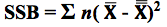 where X-bar is the Mean of an individual group and x-double-bar is the Overall Mean.
ANOVA then calculates a Mean SSB (MSB) and a Mean SSW (MSW). The previous Tip of the Week describes how these are used to calculate the value of the Test Statistic F in the F-test which produces the conclusion from the ANOVA. There is also more on this in my YouTube Video ANOVA-- Part 2, How It Does It. Sums of Squares are measures of variation; there are a number of different types. Our Tip of the Week for Dec. 21, 2017 described Sum of Squares Total (SST), which is used in Regression. Sum of Squares Within (SSW) is used in ANOVA. Sum of Squares Between (SSB) is also used in ANOVA, and it will be the topic of another Statistics Tip of the Week. Sum of Squares Within, SSW, is the sum of the Variations (as expressed by the Sums of Squares, SS's) within each of several Groups (usually Samples). SSW = SS1 + SS2 + ... + SSn This is not numerically precise, but conceptually, one might picture SS as the width of the "meaty" part of a Distribution curve – the part without the skinny tails on either side. 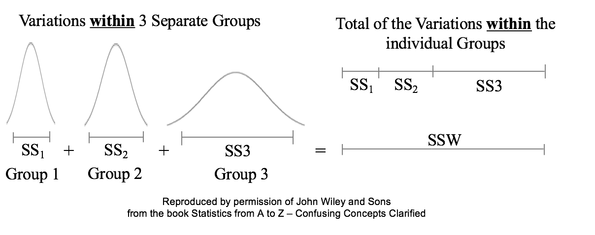 Sums of Squares Within, SSW, summarizes how much Variation there is within each of the Groups– by giving the sum of all such Variations. A comparatively small SSW indicates that the data within the individual Groups are tightly clustered about their respective Means. If the data in each Group represents the effects of a particular treatment, for example, this is indicative of consistent results (good or bad) within each individual treatment. "Small" is a relative term, so the word "comparatively" is key here. We'll need to compare SSW with SSB before being able to make a final determination.
A comparatively large SSW shows that the data within the individual Groups are widely dispersed. This would indicate inconsistent results within each individual treatment. For more on the subject and related concepts see my video, ANOVA Part 2 (of 4): How it Does It. Randomness is likely to be representative, and Simple Random Sampling (SRS) can often be the most effective way to achieve it. But in certain situations, other methods such as Systematic, Stratified, and Clustered Sampling may have an advantage. In our Tip of the Week for November 27, 2017, Stratified Sampling was described. This Tip is about Clustered Sampling. To perform Clustered Sampling,
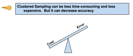 Advantage: It can be less time-consuming and less expensive. For example, the Population is the inhabitants of a city, and a cluster is a city block. We randomly select an SRS of city blocks.
There is less time and travel involved in traveling to a limited number of city blocks and then walking door to door, compared with traveling to more-widely-separated individuals all over the city. Also, one does not need a Sampling Frame listing all individuals, just all clusters. Disadvantage: The increased Variability due to between-cluster differences may reduce accuracy. Chi-Square is a Test Statistic; as such, it has a family of Distributions. There is a different Chi-Square Distribution for each value of Degrees of Freedom, df. Commonly, Degrees of Freedom is the Sample Size minus 1. But this isn't always the case with Chi-Square. That will be covered in a future Tip of the Week. Here are some examples of how the Chi-Square Distribution varies as df increases. You might observe that the shape of the Chi-Square Distribution is similar to that of the F-Distribution. For more on the Chi-Square, its Distributions and Tests, see the book or this video. 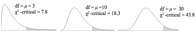 |
AuthorAndrew A. (Andy) Jawlik is the author of the book, Statistics from A to Z -- Confusing Concepts Clarified, published by Wiley. Archives
March 2021
Categories |
 RSS Feed