|
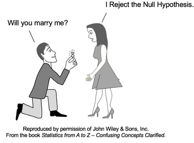
"Reject the Null Hypothesis" is one of two possible outcomes of a Hypothesis Test. The other is "Fail to Reject the Null Hypothesis". Both of these statements can be confusing to many people. Let's try to clarify the concept of "Reject the Null Hypothesis". The Null Hypothesis states that there is no (Statistically Significant)
For example,
If the results of a statistical test indicate "Reject the Null Hypothesis", that means that we conclude that there is a (Statistically Significant)
 What is the Null Hypothesis to which she is referring? As we said earlier, the Null Hypothesis says there is no difference, change, or effect. Before his proposal, they were not engaged to be married. So, if there is to be no difference, change, or effect in their relationship as a result of his proposal and her response, the Null Hypothesis would say that they are not to be engaged. 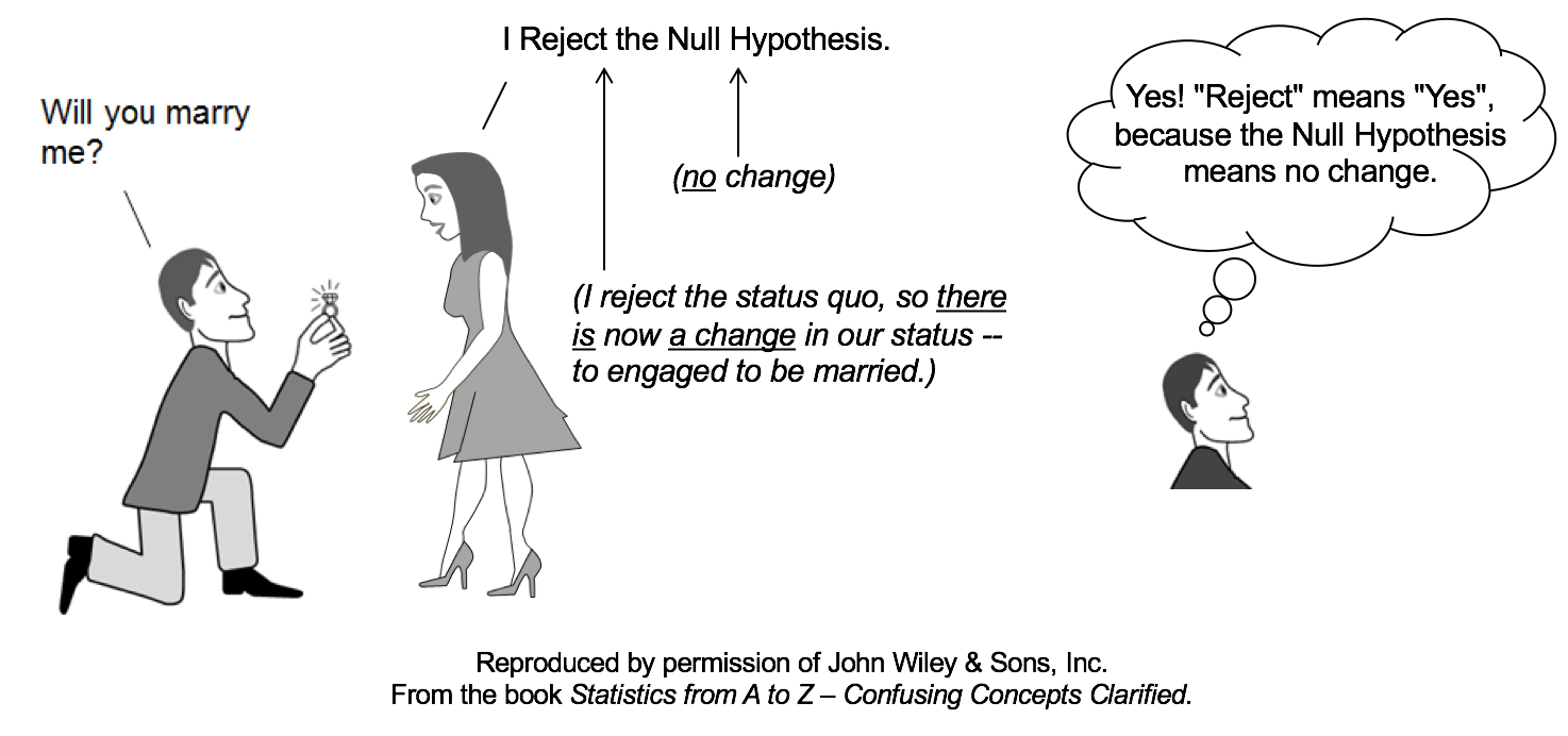 But she rejects the Null Hypothesis. This indicates that she does want there to be a difference, change, or effect. She does want to change their status to engaged to be married.
If you still find this a little confusing, you might want to go to my YouTube channel and see the video on this subject: Reject the Null Hypothesis. There are also videos on these related concepts:
For more on available and planned videos based on content from my book, see the Videos page on this website.
2 Comments
The concept of Sampling Distribution may not be used so much used on its own as it is used in describing the concepts of the Central Limit Theorem and Standard Error:
The visual we're going to use is similar to a Dot Plot of a Sample of data. Each dot represents a single value of x in the Sample. In the example below, 6 values in the Sample were x = 14, so we show 6 dots over "14" on the horizontal x-axis. 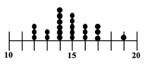 In a Sampling Distribution, the values which are plotted are not individual data points as in this dot plot. The values are Statistics calculated from Samples. Statistics are numerical properties of Samples, such as the Mean or Proportion or Standard Deviation. Let's show a plot of the Means of some Samples of data. Instead of a dot, we'll show each Mean as an x-bar symbol. 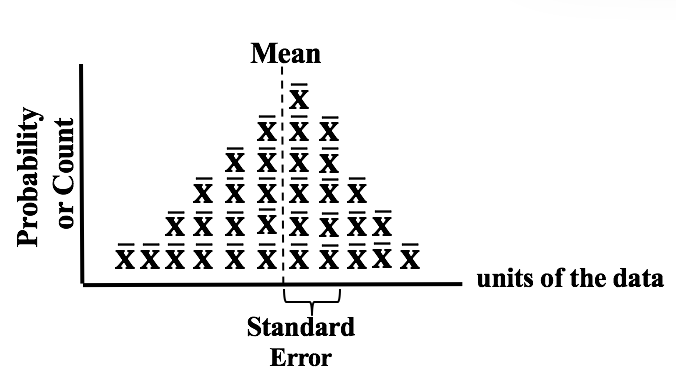 The x-bars are stacked vertically above the x axis at the point which represents their value. The height of each stack corresponds to the Probability of that value of the Mean.
This illustration shows a Sampling Distribution. The Sampling Distribution would show the Means of every possible Sample of a given size, n. You can see that the x-bars form a shape which roughly resembles a Normal Distribution. If we had many more Samples with a large n, the resemblance would be much closer. And if we calculate the Standard Deviation of the Distribution, we would get the Standard Error of the Mean. 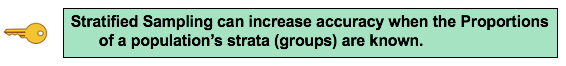 Randomness is likely to be representative, and Simple Random Sampling (SRS) can often be the most effective way to achieve it. But in certain situations, other methods such as Systematic, Stratified, and Clustered Sampling may have an advantage.
Stratified Sampling can be used when we know the Proportions of homogeneous groups which make up the population. Stratified Sampling
Advantage: Stratified Sampling avoids selecting a Sample which is not representative -– at least with regard to the Proportions of the homogenous groups. Disadvantage: It can't be used when there are no homogeneous groups. Statistics Tip of the Week: Statistics Seesaws -- Sample Size for Proportions of Count Data11/16/2017 Minimum Sample Sizes are calculated differently for Count Data (e.g. votes in an election) and Measurement Data (e.g. weight, temperature, etc.) Count Data are non-negative integers like 0, 1, 2, etc. Proportion is a statistic commonly used with Count Data. Here are some examples: 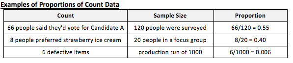 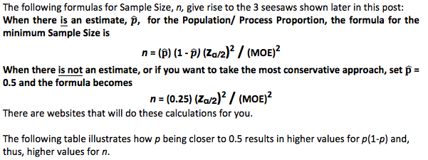 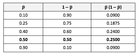 The following things increase the minimum Sample Size:
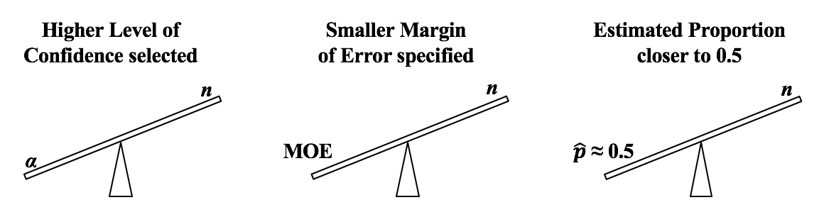 Alpha, α, the Significance Level, is selected by the tester. It is the largest Probability of an Alpha (False Positive) Error which they are willing to accept and still conclude that any difference, change, or effect is Statistically Significant. Most commonly α = 5% is selected. If are willing to accept only a low Probability of Alpha Error, then we need a larger Sample Size (n).
If we want a smaller Margin of Error, then n has to be larger. And if the Proportion is closer to 50%, then we need a larger Sample Size, n. We run into p and Test Statistics – such as t, F, z, and χ2 – in a number of statistical tests, such as t-tests, F-tests, and ANOVA. After performing one of these tests, we come to a conclusion based on whether p ≤ or > 0.05 (or other value for Alpha) – or whether t < or > t-critical. But beginners can sometimes forget which way the "<" or ">" is supposed to point: Does p < Alpha tells us that there is or is not a Statistically Significant difference? The following is a non-statistical gimmick, but it may be helpful for some – it was for me. In this book, we don't focus on confusing things like the "nothingness" of the Null Hypothesis. We focus on something that does exist – like a difference, a change or an effect. So, to make things easy, we want a memory cue that tells us when there is something, as opposed to nothing. We can come to the following conclusions (depending on the test): 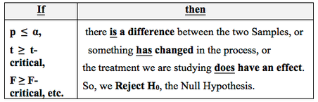 Q: But how do we remember which way the inequality symbol should go? The book gives 3 rules and a statistical explanation and the following visual cue: Remember back in kindergarten or first grade, when you were learning how to print? The letters of the Alphabet were aligned in 3 zones – middle, upper, and lower as below. p is different from t or F, because p extends into the lower zone, while F, t, and χ2 extend into the upper zone. (z doesn't; it stays in the middle zone. But we can remember that z is similar to t.) If we associate the lower zone with less than, and the upper zone with greater than, we have the following memory cue: 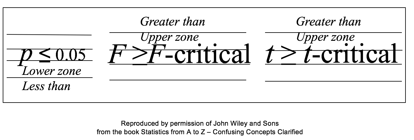 My blog post of April 6, 2017 discussed how Control Charts and Run Rules are used to distinguish Common Cause from Special Cause Variation. Common Cause Variation is the usual, expected, random "noise" variation that all processes have. It occurs within limits and it exhibits no pattern. If all we have is Common Cause Variation, then we can begin implementing process improvement techniques to reduce this variation. 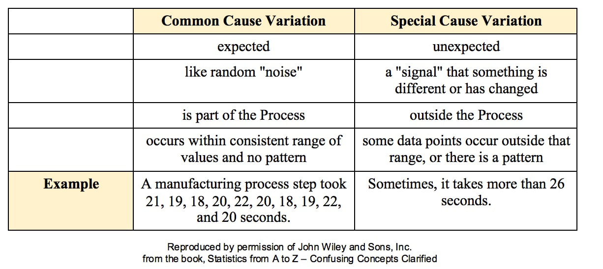 But if the variation exceeds the limits in a Control Chart or if it exhibits patterns described in Run Rules, then the process in not in control. Special Cause Variation is in effect, and that needs to be addressed first. There are a number of different types of Control Charts. For Discrete/ Count data (integers) here are the Control Charts to use. 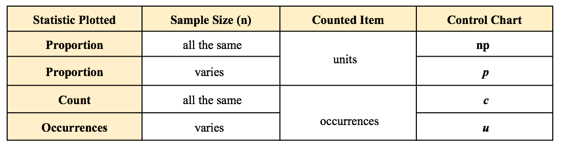 What's the difference between units and occurrences? Let's say we are inspecting shirts that we are manufacturing. One shirt with 3 defects would count as 1 defective unit or 3 occurrences of defects. For Continuous/ Measurement data (real numbers), use the following charts: 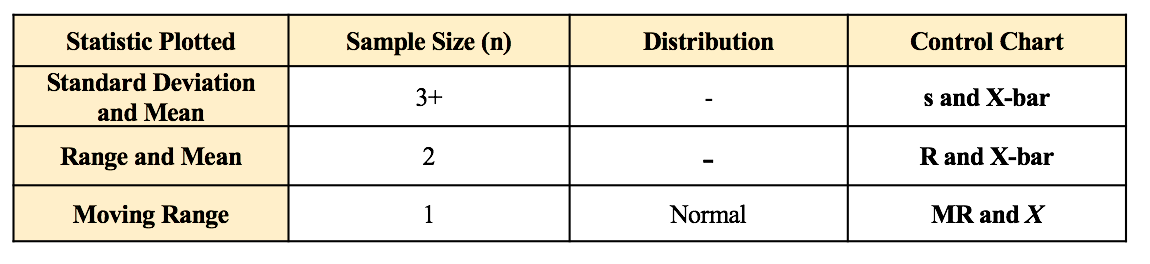 p is the Probability of an Alpha (false positive) Error. The p-value is calculated as the area under the curve bounded by the Test Statistic value. 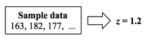 As shown in the concept flow diagram above, the first thing we do is take the Sample data and calculate a value for the Test Statistic. In this example, the value of the Test Statistic, z, is calculated to be 1.2. 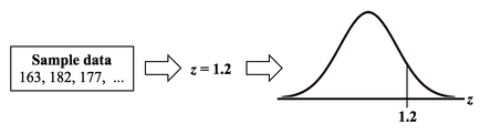 Next, (illustrated here for a 1-tailed test), we plot the Test Statistic value on the horizontal axis of the Probability Distribution of the Test Statistic. (For a 2-tailed test, we would plot 1/2 the value of z at the left and right ends sides of the curve. In this example, we would plot z/2 = 0.6 and -z/2 = -0.6). 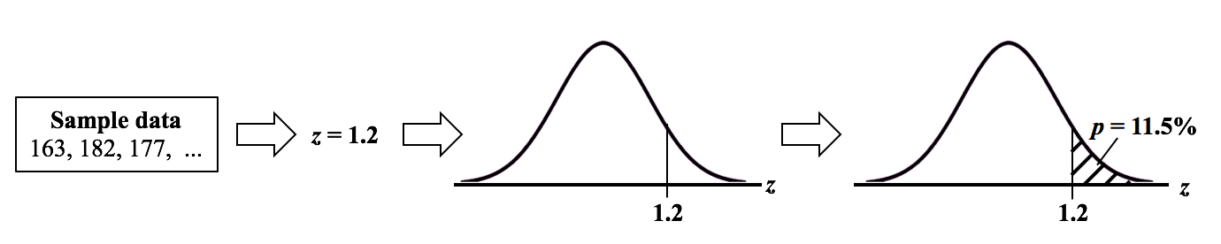 The Test Statistic Value forms the boundary of an area under the curve extending outward from the Test Statistic value. Here we show a hatched area from z = 1.2 outward to infinity. The hatched area under the curve is calculated as the Cumulative Probability of all points under the curve from z = 1.2 outward. This gives us the value for p. For more on the concepts involved here, please see my videos:
A Statistic is a numerical property calculated from Sample data. A Test Statistic is one which has an associated Probability Distribution. Given a value for a Test Statistic, the Probability Distribution will tell us the Probability of that value occurring. How this is used in statistical tests and Hypothesis Testing is described in my video on the concept of Test Statistic. There are 4 commonly-used Test Statistics -- z, t, F, and Chi-Square. They are used in different types of test as summarized in the table below: 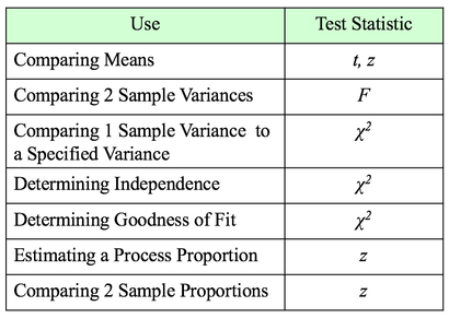 Both t and z can be used in comparing Means. The test will tell you whether there is a Statistically Significant difference between the Means. But z has some shortcomings, especially when the Sample Size, n, is not large. So, it's probably best to use t for comparing Means. There are 3 different types of t-tests:
The 1-Sample t-test compares a specified Mean to the Mean calculated from 1 Sample of data. The specified Mean can be a target value, a historical value, an estimate, or anything else. The difference between the 2-Sample and Paired t-test is explained in my first blog post, back in Sept. 22, 2016. The Mean is one Statistic. The Variance is another. There are two different Test Statistics used with Variances: F and Chi-Square 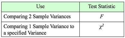 If we want to determine if there is a Statistically Significant different in the Variance of 2 Populations or Processes, we use the Test Statistic F and an F-Test. This is analogous to the 2-Sample t-test. If, on the other hand, we want to compare the Variance of a Population or Process to a specified Variance, we use the Chi-Square Test Statistic and the Chi-Square Test for the Variance. This test is analogous to the 1-Sample t-test. Chi-Square is a versatile Test Statistic, It is used in 2 other types of statistical tests:
The Chi-Square Test for Independence can tell us, for example, whether or not gender and ice-cream preference are independent (males and females show similar preferences) or dependent (one gender likes a given flavor and the other gender likes another.) The test is needed to determine if any observed difference is Statistically Significant. And the Chi Square Test for Goodness of Fit can tell us whether there is a Statistically Significant difference between a set of expected or predicted Frequencies (percentages converted to Counts) and the actual Frequencies shown in a Sample of data. For example, we might predict the set of percentages of customers each day as shown in the "Expected" row in the table below. And the "Observed" counts would be the number of customers who actually came. Is the expected/ predicted set of percentages a good fit with the actual? A "good fit" means that there is not a Statistically Significant difference between Expected and Observed. 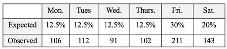 The Test Statistic z can be used to determine whether there is a Statistically Significant difference between the the Proportions of 2 Populations or Processes. It can also give us a Confidence Interval estimate of a Population or Process Proportion. For example, "The Proportion of voters who favor Candidate A is 55% plus or minus 2%."
The 80/20 "rule" is a bit of folk wisdom that appears to be widely (although roughly) applicable to many situations. One usage is that 80% of the effects come from 20% of the causes. This is often the case in Statistical Process Control, in which control charts and other tools are used to identify the causes or sources of defects in a process. In the example below, we show a simplified version of a Failure Mode Effects Analysis (FMEA). It calculates an Impact Score for each source of defects. The Impact of a source of defects is defined by its Severity multiplied by the number of times it was a source of a defect. 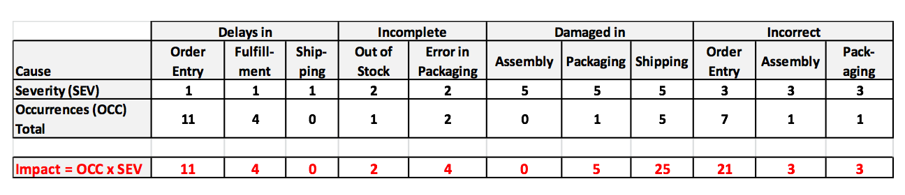 We use this information to identify which -- and how many -- causes of defects to address. To make this obvious, and to aid in communication, we will display the Impact Scores in a Pareto chart. A Pareto Chart is actually two charts overlaid on each other: a bar chart and a line chart. 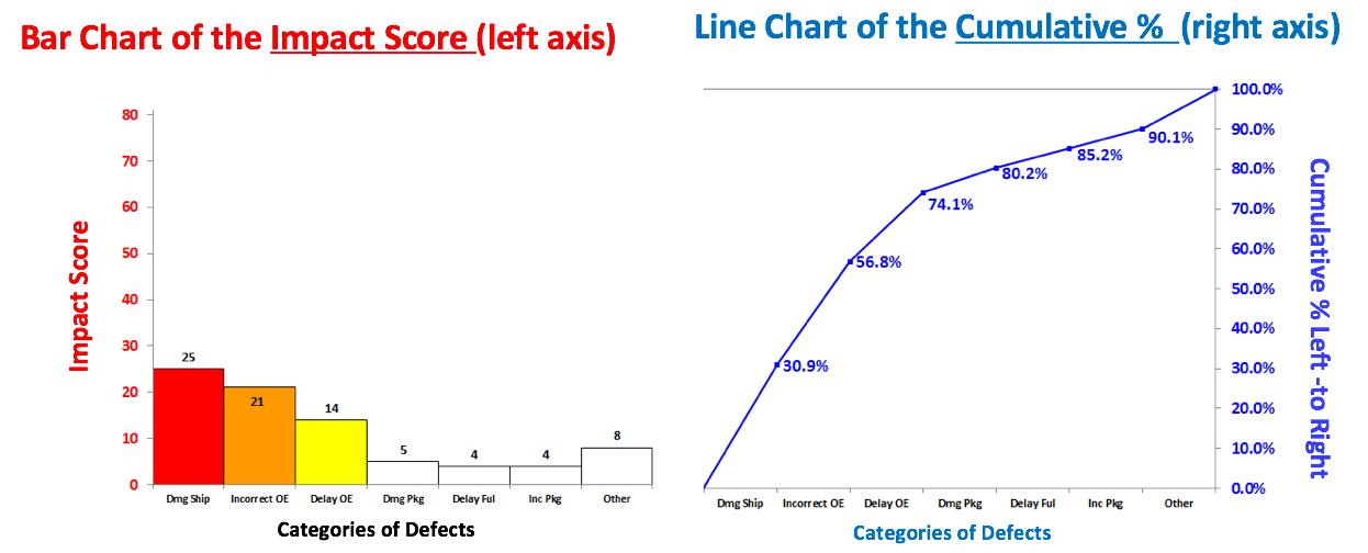 The combined chart below -- the Pareto Chart -- has 2 vertical axes. The vertical axis on the left is for the bars. The vertical axis on the right is for the line. The line shows the cumulative percentage (of the impact score) for the first column, the first two columns, the first 3 columns, etc. 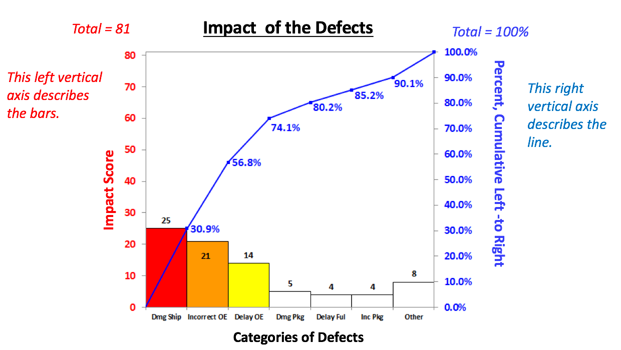 There's nothing sacred about 80%. From this combined chart, we can see that we can address 74.1% of the defects by going after just 3 causes (the colored bars). After that, diminishing returns set in.
Here, we used the Pareto Chart to prioritize sources of defects. But it can be used to prioritize anything. Use it early and often where appropriate in your analysis. And it can be very helpful in communicating the conclusions to others. Statistics Tip of the Week: There are 2 different Critical Values for a 2-sided Chi-Square test.8/30/2017 For 2-sided tests using the Test Statistics z and t, which have symmetrical Distributions, there is only one Critical Value. That Critical Value is added or subtracted from the Mean. Since Chi-Square’s Distributions are not symmetric, the areas under the curve at the left tail and the right tail side have different shapes,for a given value of that area. So, there are two different Critical Values -– an Upper and a Lower –- for a 2-sided Chi-Square test. 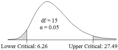 Unlike z and t, we do not add or subtract these Critical Values from the Mean. The two Critical Values of Chi-Square produced by tables, spreadsheets, or software are the final values to be used.
|
AuthorAndrew A. (Andy) Jawlik is the author of the book, Statistics from A to Z -- Confusing Concepts Clarified, published by Wiley. Archives
March 2021
Categories |

 RSS Feed