|
I just uploaded a new video to my YouTube channel: Probability Distributions -- Part 1 (of 3): What They Are. Part 2 will be about How They Are Used, and Part 3 will be Which to Use When. At some point, I will probably do videos on each of the 8 families of Distributions mentioned in this video. You can always see the Videos page on this website for the latest status. 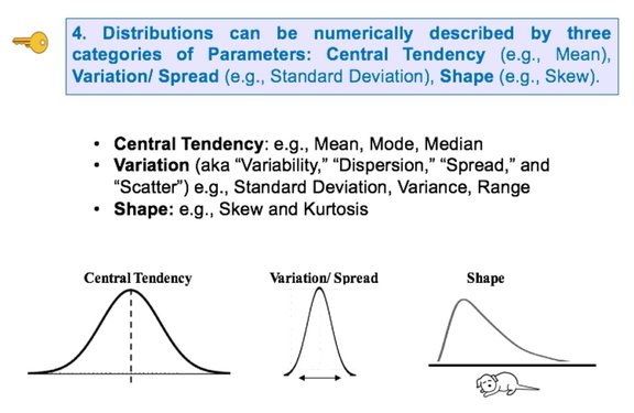
0 Comments
In earlier blog posts, we've seen how different types of charts can be used in different ways to increase our understanding of the data and to communicate that understanding to others:
Here's another example: a Line Chart uses lines to connect points that have adjacent values on the horizontal axis. It is often used to illustrate trends, with the horizontal axis representing time.  It is also used to graph cause-and-effect, in which the x Variable (horizontal axis) is the Factor which causes the Effect in the y Variable (vertical axis). In the chart below, an increase in the Factor Variable, water temperature, causes an increase in the Effect Variable, cleanliness. This is used in Regression analysis and in the Designed Experiments which are conducted to test a Regression Model. 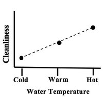 The following chart combines two line charts into one. It has the same x and y Variables as the previous chart, but it adds a second Factor (x) Variable, Detergent. So, there are two lines, connecting two sets of data points. In 2-Way ANOVA, crossing lines indicate that there is an Interaction between the two Factors. In this case, an increase in temperature has the opposite effect for the two detergent types – it makes Detergent #1 do better, and it makes Detergent #2 do worse. If the lines were parallel or did not cross, then there would be no Interaction. 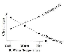 In a similar fashion, a Line Chart can help differentiate between Observed and Expected Frequencies in a Chi-Square test for Goodness of Fit. Reproduced by permission of John Wiley and Sons, Inc.
from the book, Statistics from A to Z -- Confusing Concepts Clarified A "Statistic" is a measure of a property of a Sample, for example, the Sample Mean or Sample Standard Deviation. The corresponding term for a Population or Process is "Parameter". The most commonly used statistical tests are "Parametric", that is, they require that one or more Parameters meet certain conditions or "assumptions". Most frequently, the assumption is that the Distribution of the Population or Process is roughly Normal. Roughly equal Variance is also a common assumption. If these conditions are not met, the Parametric test cannot be used, and a Nonparametric test must be used instead. This table shows the Nonparametric test that can be used in place of several common Parametric tests. 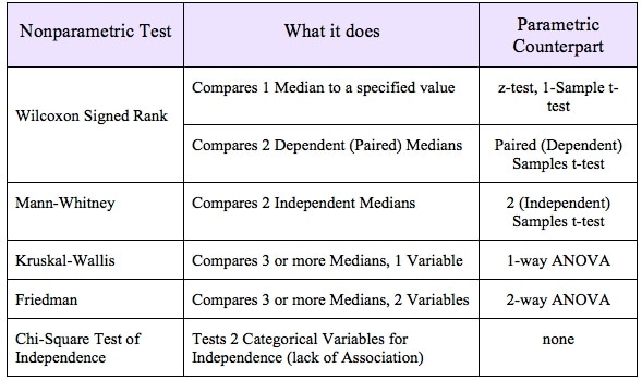 |
AuthorAndrew A. (Andy) Jawlik is the author of the book, Statistics from A to Z -- Confusing Concepts Clarified, published by Wiley. Archives
March 2021
Categories |
 RSS Feed