|
Links: channel, this video This is the 3rd of 5 videos in a playlist that describes 4 concepts at the heart of Inferential Statistics and how they work together. The first two were on the concept of p, the p-value and Alpha, the Significance Level. The 4th will be on Test Statistic. The 5th video will concentrate on how they all interrelate and work together. Here are the 3 Keys to Understanding (KtUs) the concept of Critical Value: 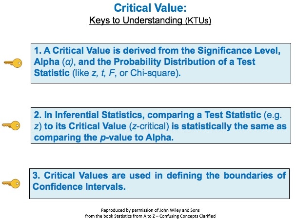 And here are two concept flow diagrams which help explain the 1st KTU: 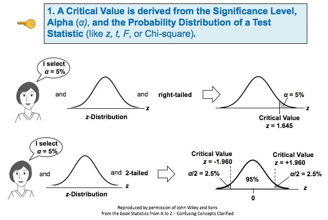 And here is a Compare and Contrast Table which helps explain how p > α is the same as test statistic value < critical value. 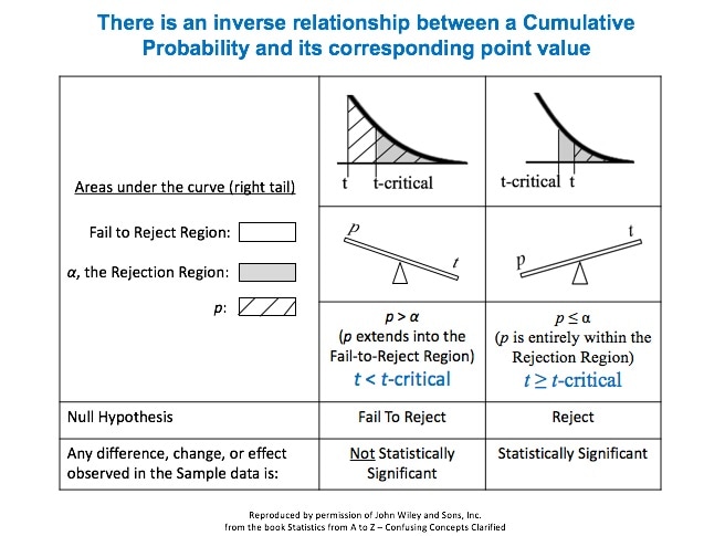
1 Comment
Statistics Tip of the Week: The Central Limit Theorem applies to Proportions, as well as to Means.1/25/2017 The Central Limit Theorem (CLT) is a powerful concept, because it enables us to use the known Probabilities of the Normal Distribution in statistical analyses of data which are not Normally distributed. It is most commonly known as applying to the Means of Samples of data. 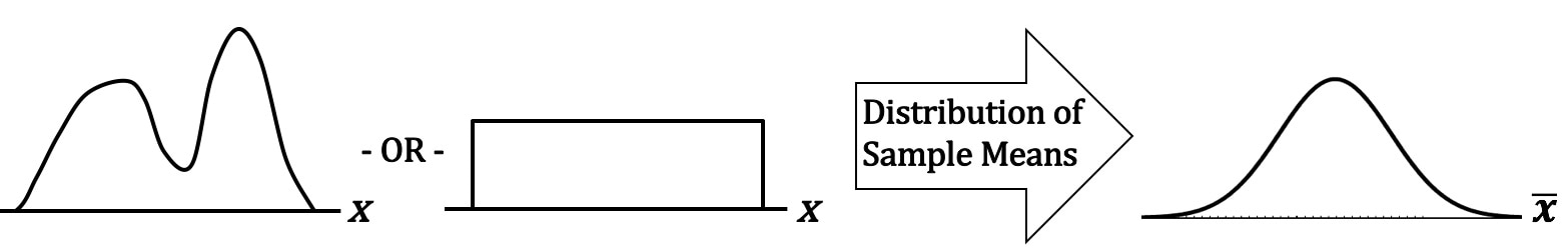 The data can be distributed in any way. For example -- as shown above -- it can be double-peaked and asymmetrical, or it can have the same number of points for every value of x. If we take many sufficiently large Samples of data with any Distribution, the Distribution of the Means of these Samples will be approximate the Normal Distribution. There is something intuitive about the CLT. The Mean of a Sample taken from any Distribution is very unlikely to be at the far left or far right of the range of the Distribution. Means (averages), by their very definition, tend to average-out extremes. So, their Probabilities would be highest in the center of a Distribution and lowest at the extreme left or right. Less intuitively obvious is that the CLT applies to Proportions as well as to Means. 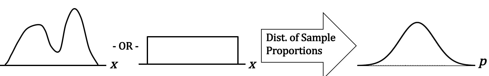 Let's say that p is the Proportion of the count of a category of items in a Sample, say the Proportion of green jelly beans in a pack of assorted jelly beans. We take many Samples, with replacement, of the same size n, and we calculate the Proportion for each Sample. When we graph these Proportions, they will approximate a Normal Distribution. How large of a Sample Size, n, is "sufficiently large"? It depends on the use and the statistic. For Means and most uses n > 30 is considered large enough. But for Proportions, it's a little more complicated -- it depends on what the value of p is. n is large enough if np > 5 and n(1 - p) > 5. The practical effect of this is:
This table gives us the specifics; the minimum Sample Size, n, is shown in the middle row. 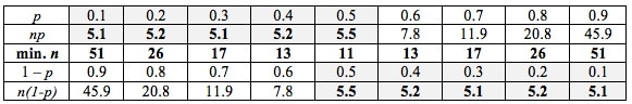
He is president of the Pyzdek Institute and co-author of The Lean Six Sigma Handbook. In an earlier "You are not alone" post, he described the "sheer terror" which some of his technical students have for statistics.
Here's what he says about his own experience: "In my opinion, statistics hypothesis testing is confusing. I have to take my time to be sure I don't make a mistake, and I've been at this a very long time." In determining which Distribution to use in analyzing Discrete (Count) data, we need to know whether we are interested in Occurrences or Units. Let's say we are inspecting shirts at the end of the manufacturing line. We may be interested in the number of defective Units – shirts, because any defective shirt is likely to be rejected by our customer. However, one defective shirt can contain more than one defect. So, we are also interested in the Count of individual defects – the Occurrences – because that tells us how much of a quality problem we have in our manufacturing process. For example, if 1 shirt has 3 defects, that would be 3 Occurrences of a defect, but only 1 Unit counted as defective. We would use the Poisson Distribution in analyzing Probabilities of Occurrences of defects. To analyze the Probability of Units, we could use the Binomial or the Hypergeometric Distribution. Below are two graphs of the Poisson Distribution -- one for the Distribution with the Mean of 3 and the other with a Mean of 15. You can see how the Distribution spreads out (the Variance gets larger) as the Mean gets larger. In fact, the Mean of a Poisson Distribution is equal to its Variance. 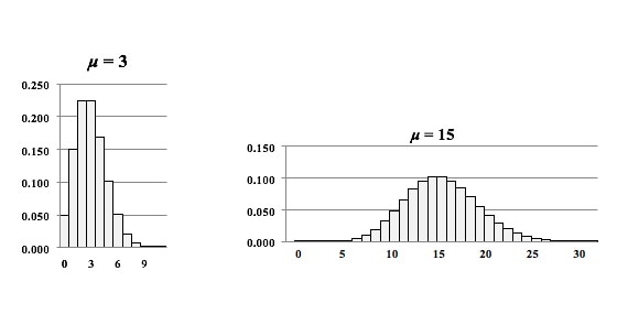 Links: channel , this video This is the 2nd of 5 videos in a playlist that describes 4 concepts central to Inferential Statistics and how they work together. The first video was on the concept of p, the p-value and the others will be Critical Value and Test Statistic. The 5th video will concentrate on how they all interrelate and work together. Here are the 5 Keys to Understanding the concept of Alpha, the Significance level. 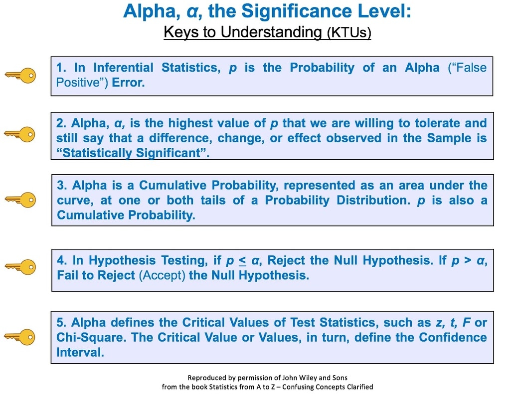 And here's an example of a concept flow diagram in the video: 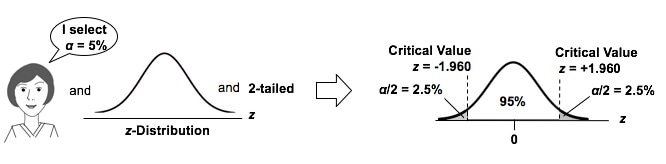 These are all terms used in Correlation and Linear Regression (Simple and Multiple). And some of these terms have several names. I don't know about you, but I get confused trying to keep them all straight. So I wrote this compare-and-contrast table, which should help. 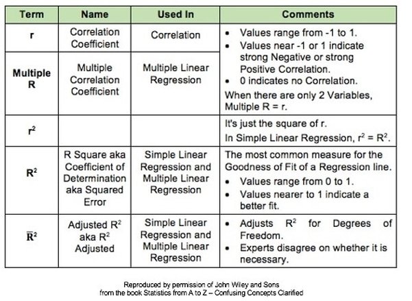 Statistics Tip of the Week: Don't extrapolate your conclusions beyond the range of your data.1/5/2017 In Regression, we attempt to fit a line or curve to the data. Let's say we're doing Simple Linear Regression in which we are trying to fit a straight line to a set of (x,y) data. We test a number of subjects with dosages from 0 to 3 pills. And we find a straight line relationship, y = 3x, between the number of pills (x) and a measure of health of the subjects. So, we can say this. 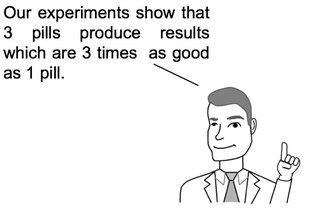 But we cannot make a statement like the following. 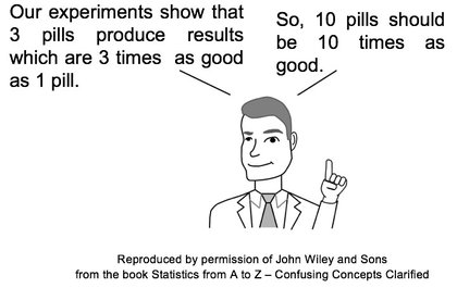 This is called extrapolating the conclusions of your Regression Model beyond the range of the data used to create it. There is no mathematical basis for doing that, and it can have negative consequences: 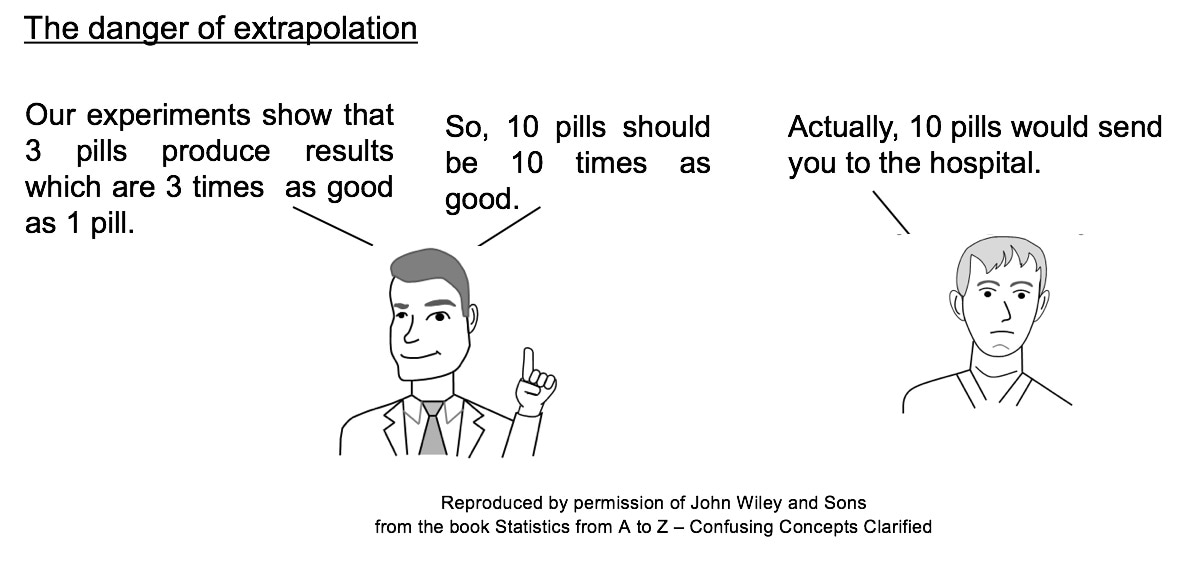 In the graphs below, the dots are data points. In the graph on the left, it is clear that there is a linear correlation between the drug dosage (x) and the health outcome (y) for the range we tested, 0 to 3 pills. And we can interpolate between the measured points. For example, we might reasonably expect that 1.5 pills would yield a health outcome halfway between that of 1 pill and 2 pills. 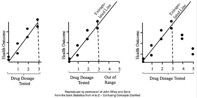 But, we have no data beyond 3 pills, so we have no basis for extrapolating this conclusion and for assuming that the same relationship holds beyond 3 pills. In fact -- as the graph on the right illustrates -- when we did test dosages beyond 3 pills, the health outcomes got progressively worse.
|
AuthorAndrew A. (Andy) Jawlik is the author of the book, Statistics from A to Z -- Confusing Concepts Clarified, published by Wiley. Archives
March 2021
Categories |


 RSS Feed