|
One thing that many people find confusing about statistics is the inconsistency in names of concepts. The names for x and y variables are an example; If we have an equation y = f(x) or y = f(x1, x2, ..., xn) what name do we have for the concept of y and for that of x? Most of us are familiar with x being identified as the Independent Variable, and y as the Dependent Variable. That makes sense, since x can vary independently, but the value of y is dependent on the value of x. 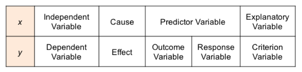 (Thanks to Ben Atkinson for pointing out a typo in the originally posted version of this table.)
Some call x the Cause and y the Effect. In Regression and in other uses, x is sometimes called the Predictor Variable, because its value predicts the value of the Outcome Variable, y. y is also called the Response Variable. And then there is Explanatory Variable and Criterion Variable. Explanatory and Independent are often used interchangeably. But some authors make a distinction, using the term "explanatory" when it is not certain that the variable is independent.
1 Comment
This new video explains 5 Keys to Understanding the concept of Normal Distribution. See the Videos page of this website for the status of videos done and planned. 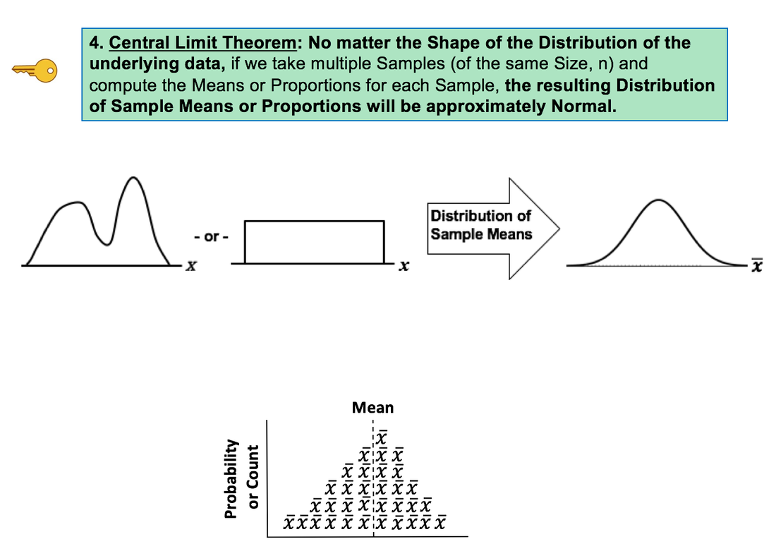 Hypothesis Testing is confusing for many, if not most, people. The graphical concepts of Acceptance and Rejection Regions may help clarify the confusion.
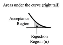
Sample data is collected and the t-test is run. The test calculates a value for p. Like Alpha, p is a Cumulative Probability shown as an area under the curve of the t-Distribution. The illustration below shows the two possible results. Here, we show p as a hatched area and Alpha as a shaded area. The middle diagram shows the result in which p is calculated to be less than or equal to Alpha. In that case, the hatched area representing p fits entirely within the shaded Rejection Region which represents Alpha. So, the conclusion of the test is to Reject the Null Hypothesis. 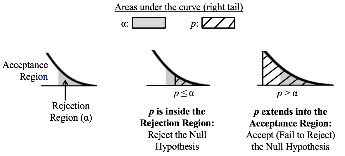 The right diagram shows the case in which p is larger than Alpha. The hatched area representing p is larger than the shaded Rejection Region, and it extends into the unshaded Acceptance Region. So, the conclusion of the test is to Accept -- that is, Fail to Reject -- the Null Hypothesis.
If you would like more information on Alpha, p, Null Hypothesis, Fail to Reject, and other concepts in Hypothesis Testing, there are individual videos on each concept in my YouTube channel, which has the same name as the book: "Statistics from A to Z -- Confusing Concepts Clarified." The 13th in our irregular "You are not alone ..." series.
Even statisticians are not immune to misinterpretations of Null Hypothesis Significance Tests. http://bit.ly/2hdr11o A Statistic is a numerical property calculated from Sample data. A Test Statistic is one which has an associated Probability Distribution. Given a value for a Test Statistic, the Probability Distribution will tell us the Probability of that value occurring. How this is used in statistical tests and Hypothesis Testing is described in my video on the concept of Test Statistic. There are 4 commonly-used Test Statistics -- z, t, F, and Chi-Square. They are used in different types of test as summarized in the table below: 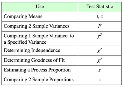 Both t and z can be used in comparing Means. The test will tell you whether there is a Statistically Significant difference between the Means. But z has some shortcomings, especially when the Sample Size, n, is not large. So, it's probably best to use t for comparing Means. There are 3 different types of t-tests:
The 1-Sample t-test compares a specified Mean to the Mean calculated from 1 Sample of data. The specified Mean can be a target value, a historical value, an estimate, or anything else. The difference between the 2-Sample and Paired t-test is explained in my first blog post, back in Sept. 22, 2016. The Mean is one Statistic. The Variance is another. There are two different Test Statistics used with Variances: F and Chi-Square 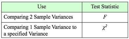 If we want to determine if there is a Statistically Significant different in the Variance of 2 Populations or Processes, we use the Test Statistic F and an F-Test. This is analogous to the 2-Sample t-test. If, on the other hand, we want to compare the Variance of a Population or Process to a specified Variance, we use the Chi-Square Test Statistic and the Chi-Square Test for the Variance. This test is analogous to the 1-Sample t-test. Chi-Square is a versatile Test Statistic, It is used in 2 other types of statistical tests:
The Chi-Square Test for Independence can tell us, for example, whether or not gender and ice-cream preference are independent (males and females show similar preferences) or dependent (one gender likes a given flavor and the other gender likes another.) The test is needed to determine if any observed difference is Statistically Significant. And the Chi Square Test for Goodness of Fit can tell us whether there is a Statistically Significant difference between a set of expected or predicted Frequencies (percentages converted to Counts) and the actual Frequencies shown in a Sample of data. For example, we might predict the set of percentages of customers each day as shown in the "Expected" row in the table below. And the "Observed" counts would be the number of customers who actually came. Is the expected/ predicted set of percentages a good fit with the actual? A "good fit" means that there is not a Statistically Significant difference between Expected and Observed. 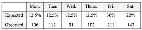 The Test Statistic z can be used to determine whether there is a Statistically Significant difference between the the Proportions of 2 Populations or Processes. It can also give us a Confidence Interval estimate of a Population or Process Proportion. For example, "The Proportion of voters who favor Candidate A is 55% plus or minus 2%."
The 80/20 "rule" is a bit of folk wisdom that appears to be widely (although roughly) applicable to many situations. One usage is that 80% of the effects come from 20% of the causes. This is often the case in Statistical Process Control, in which control charts and other tools are used to identify the causes or sources of defects in a process. In the example below, we show a simplified version of a Failure Mode Effects Analysis (FMEA). It calculates an Impact Score for each source of defects. The Impact of a source of defects is defined by its Severity multiplied by the number of times it was a source of a defect. 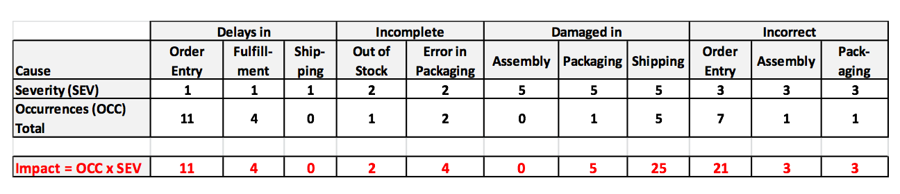 We use this information to identify which -- and how many -- causes of defects to address. To make this obvious, and to aid in communication, we will display the Impact Scores in a Pareto chart. A Pareto Chart is actually two charts overlaid on each other: a bar chart and a line chart. 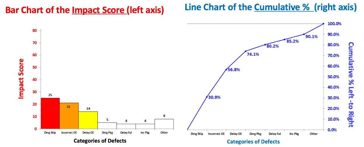 The combined chart below -- the Pareto Chart -- has 2 vertical axes. The vertical axis on the left is for the bars. The vertical axis on the right is for the line. The line shows the cumulative percentage (of the impact score) for the first column, the first two columns, the first 3 columns, etc. 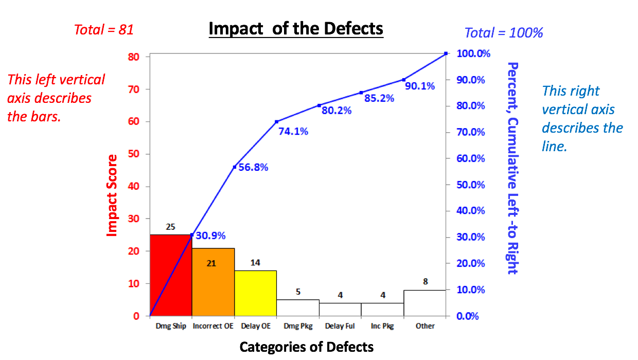 There's nothing sacred about 80%. From this combined chart, we can see that we can address 74.1% of the defects by going after just 3 causes (the colored bars). After that, diminishing returns set in.
Here, we used the Pareto Chart to prioritize sources of defects. But it can be used to prioritize anything. Use it early and often where appropriate in your analysis. And it can be very helpful in communicating the conclusions to others. This video, like the article in the book on which it is based, explains 5 Keys to Understanding the concept. It is part of a playlist on Distributions which may include as many as 14 videos. For more on this, see the videos page of this website.  |
AuthorAndrew A. (Andy) Jawlik is the author of the book, Statistics from A to Z -- Confusing Concepts Clarified, published by Wiley. Archives
March 2021
Categories |

 RSS Feed