|
The 80/20 "rule" is a bit of folk wisdom that appears to be widely (although roughly) applicable to many situations. One usage is that 80% of the effects come from 20% of the causes. This is often the case in Statistical Process Control, in which control charts and other tools are used to identify the causes or sources of defects in a process. In the example below, we show a simplified version of a Failure Mode Effects Analysis (FMEA). It calculates an Impact Score for each source of defects. The Impact of a source of defects is defined by its Severity multiplied by the number of times it was a source of a defect. 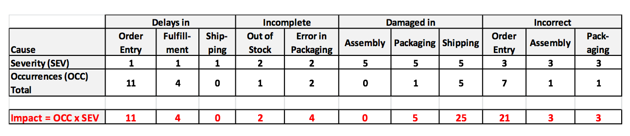 We use this information to identify which -- and how many -- causes of defects to address. To make this obvious, and to aid in communication, we will display the Impact Scores in a Pareto chart. A Pareto Chart is actually two charts overlaid on each other: a bar chart and a line chart. 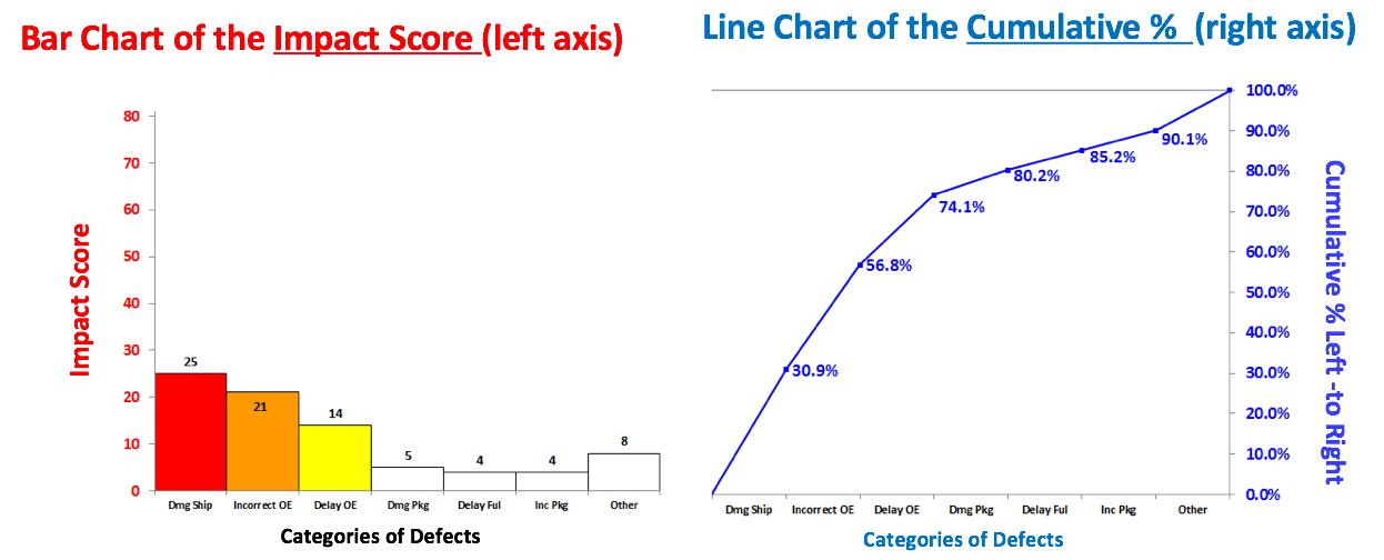 The combined chart below -- the Pareto Chart -- has 2 vertical axes. The vertical axis on the left is for the bars. The vertical axis on the right is for the line. The line shows the cumulative percentage (of the impact score) for the first column, the first two columns, the first 3 columns, etc. 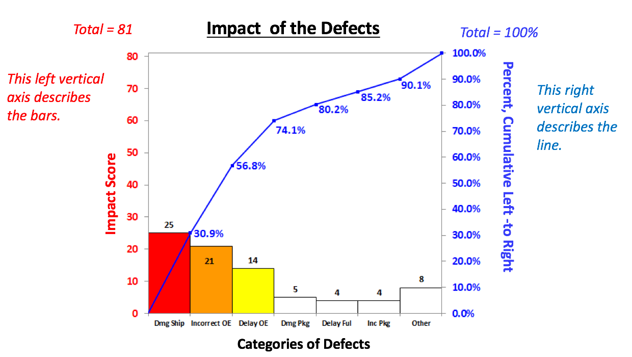 There's nothing sacred about 80%. From this combined chart, we can see that we can address 74.1% of the defects by going after just 3 causes (the colored bars). After that, diminishing returns set in.
Here, we used the Pareto Chart to prioritize sources of defects. But it can be used to prioritize anything. Use it early and often where appropriate in your analysis. And it can be very helpful in communicating the conclusions to others.
0 Comments
Leave a Reply. |
AuthorAndrew A. (Andy) Jawlik is the author of the book, Statistics from A to Z -- Confusing Concepts Clarified, published by Wiley. Archives
March 2021
Categories |

 RSS Feed