|
The concept of Sampling Distribution may not be used so much used on its own as it is used in describing the concepts of the Central Limit Theorem and Standard Error:
The visual we're going to use is similar to a Dot Plot of a Sample of data. Each dot represents a single value of x in the Sample. In the example below, 6 values in the Sample were x = 14, so we show 6 dots over "14" on the horizontal x-axis. 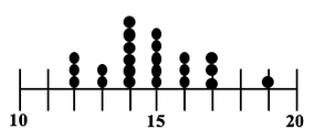 In a Sampling Distribution, the values which are plotted are not individual data points as in this dot plot. The values are Statistics calculated from Samples. Statistics are numerical properties of Samples, such as the Mean or Proportion or Standard Deviation. Let's show a plot of the Means of some Samples of data. Instead of a dot, we'll show each Mean as an x-bar symbol. 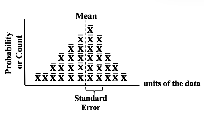 The x-bars are stacked vertically above the x axis at the point which represents their value. The height of each stack corresponds to the Probability of that value of the Mean.
This illustration shows a Sampling Distribution. The Sampling Distribution would show the Means of every possible Sample of a given size, n. You can see that the x-bars form a shape which roughly resembles a Normal Distribution. If we had many more Samples with a large n, the resemblance would be much closer. And if we calculate the Standard Deviation of the Distribution, we would get the Standard Error of the Mean.
1 Comment
 Randomness is likely to be representative, and Simple Random Sampling (SRS) can often be the most effective way to achieve it. But in certain situations, other methods such as Systematic, Stratified, and Clustered Sampling may have an advantage.
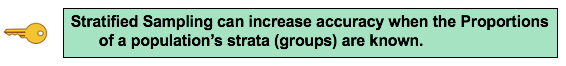
Stratified Sampling can be used when we know the Proportions of homogeneous groups which make up the population. Stratified Sampling
Advantage: Stratified Sampling avoids selecting a Sample which is not representative -– at least with regard to the Proportions of the homogenous groups. Disadvantage: It can't be used when there are no homogeneous groups. Viewers noticed 2 typos in this video -- my apologies. There was no way to revise the video on YouTube, so I had to delete it and upload a replacement. Here is the link to the corrected video youtu.be/KEq9X_x6xuM .
Statistics Tip of the Week: Statistics Seesaws -- Sample Size for Proportions of Count Data11/16/2017 Minimum Sample Sizes are calculated differently for Count Data (e.g. votes in an election) and Measurement Data (e.g. weight, temperature, etc.) Count Data are non-negative integers like 0, 1, 2, etc. Proportion is a statistic commonly used with Count Data. Here are some examples: 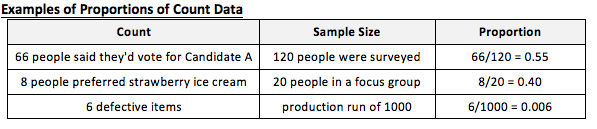 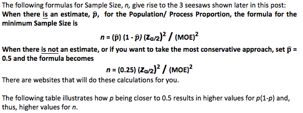 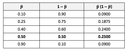 The following things increase the minimum Sample Size:
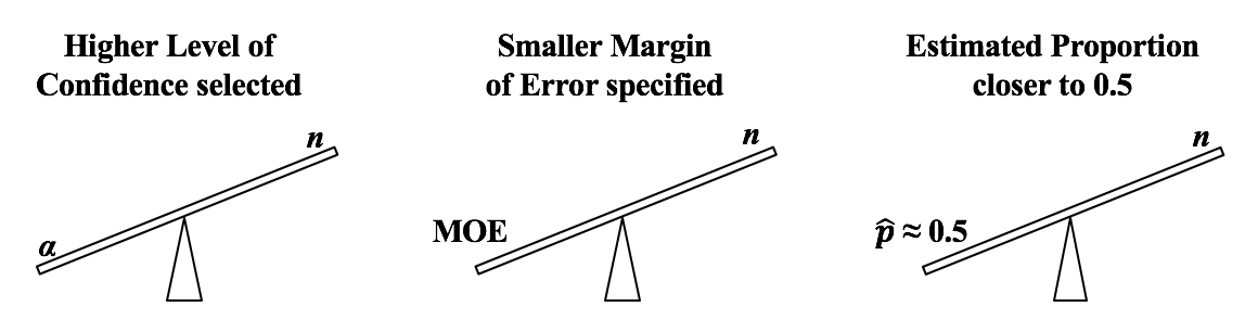 Alpha, α, the Significance Level, is selected by the tester. It is the largest Probability of an Alpha (False Positive) Error which they are willing to accept and still conclude that any difference, change, or effect is Statistically Significant. Most commonly α = 5% is selected. If are willing to accept only a low Probability of Alpha Error, then we need a larger Sample Size (n).
If we want a smaller Margin of Error, then n has to be larger. And if the Proportion is closer to 50%, then we need a larger Sample Size, n. We run into p and Test Statistics – such as t, F, z, and χ2 – in a number of statistical tests, such as t-tests, F-tests, and ANOVA. After performing one of these tests, we come to a conclusion based on whether p ≤ or > 0.05 (or other value for Alpha) – or whether t < or > t-critical. But beginners can sometimes forget which way the "<" or ">" is supposed to point: Does p < Alpha tells us that there is or is not a Statistically Significant difference? The following is a non-statistical gimmick, but it may be helpful for some – it was for me. In this book, we don't focus on confusing things like the "nothingness" of the Null Hypothesis. We focus on something that does exist – like a difference, a change or an effect. So, to make things easy, we want a memory cue that tells us when there is something, as opposed to nothing. We can come to the following conclusions (depending on the test): 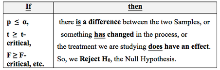 Q: But how do we remember which way the inequality symbol should go? The book gives 3 rules and a statistical explanation and the following visual cue: Remember back in kindergarten or first grade, when you were learning how to print? The letters of the Alphabet were aligned in 3 zones – middle, upper, and lower as below. p is different from t or F, because p extends into the lower zone, while F, t, and χ2 extend into the upper zone. (z doesn't; it stays in the middle zone. But we can remember that z is similar to t.) If we associate the lower zone with less than, and the upper zone with greater than, we have the following memory cue: 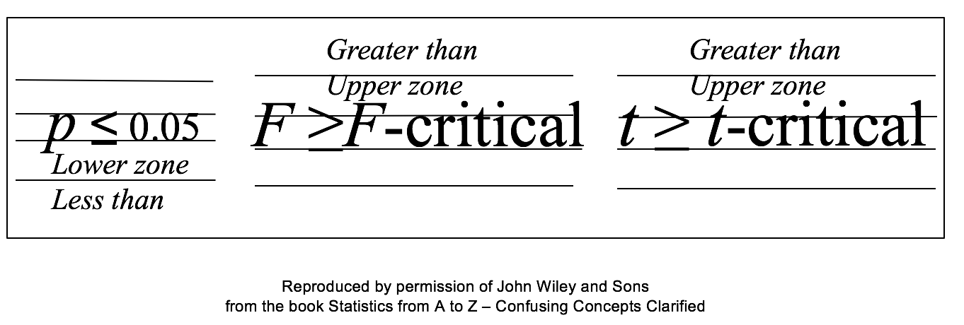 See my latest video. See the Videos page of this website for the status of available and planned videos.  |
AuthorAndrew A. (Andy) Jawlik is the author of the book, Statistics from A to Z -- Confusing Concepts Clarified, published by Wiley. Archives
March 2021
Categories |


 RSS Feed