|
In last week's Tip of the Week, we said that a Histogram was good for picturing the shape of the data. What a Histogram is not good for is picturing Variation -- as measured by Standard Deviation or Variance. The size of the range for each bar is purely arbitrary. Larger ranges would make for fewer bars and a narrower picture. Also, the width of the bars in the picture can be varied, making the spread appear wider or narrower. A Dot Plot can be used to picture Variation if the number of data points is relatively small. Each individual point is shown as a dot, and you can show exactly how many go into each bin. 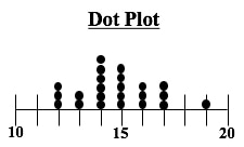 Boxplots, also known as Box and Whiskers Plots can very effectively provide a detailed picture of Variation. In our Nov. 10 2016 Tip of the Week, we showed how several Box and Whiskers Plots can enable you to visually choose the most effective of several treatments. Here's an illustration of the anatomy of a Box and Whiskers Plot  In the example above, the IQR box represents the InterQuartile Range, which is a useful measure of Variation. This plot shows us that 50% of the data points (those between the 25th and 75th Percentiles) were within the range of 40 – 60 centimeters. 25% were below 40 and 25% were above 60. The Median, denoted by the vertical line in the box is about 48 cm.
Any data point outside 1.5 box lengths from the box is called an Outlier. Here, the outlier with a value of 2 cm. is shown by a circle. Not shown above, but some plots define an Extreme Outlier as one that is more than 3 box lengths outside the box. Those can be shown by an asterisk.
0 Comments
The 4th in a playlist of 6 videos about ANOVA and related subjects. Here is a one-page summary of the Keys to Understanding this concept. View the video 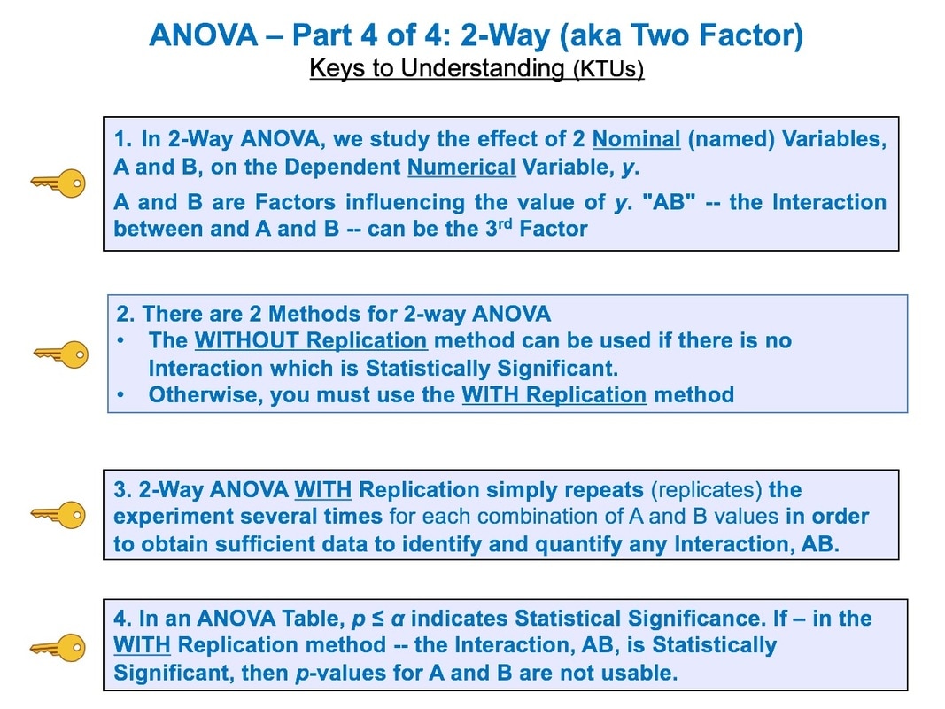 See the videos page on this website for a list of available and planned videos.
Statistics Views is an award-winning website created for professional statisticians, analysts, students, and any user of statistics in interdisciplinary subjects. It provides new articles, interviews, data sources, training materials, links to leading statistics research publications and new blogs, and job opportunities.
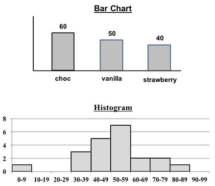 Both Bar Charts and Histograms use the height of bars (rectangles of the same width) to visually depict data. So, they look similar.
But, they
1. Separated or contiguous
2. Types of data
3. How Used
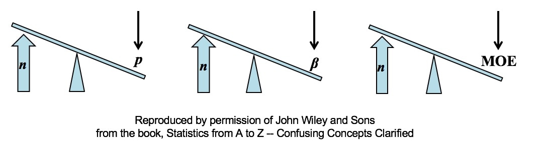 All other things being equal, an increase in Sample Size (n) reduces all types of Sampling Errors, including Alpha and Beta Errors and the Margin of Error.
A Sampling "Error" is not a mistake. It is simply the reduction in accuracy to be expected when one makes an estimate based on a portion – a Sample – of the data in Population or Process. There are several types of Sampling Error. Two types of Sampling Errors are described in terms of their Probabilities:
All three types of Sampling Error are reduced when the Sample Size is increased. This makes intuitive sense, because a very small Sample is more likely to not be a good representative of the properties of the larger Population or Process. But, the values of Statistics calculated from a much larger Sample are likely to be much closer to the values of the corresponding Population or Process Parameters. For more on p, see my video P, the p-value. In the future, there will also be videos on Alpha and Beta Error, the Margin of Error, and Confidence Intervals. You can subscribe to the channel to be notified. Here are the 4 Keys to Understanding from this video: 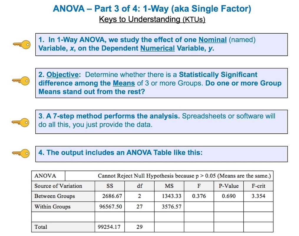 This is the 3rd of 6 videos based on content from the book that I plan to make on the topic of ANOVA and related concepts:
See my channel for other videos based on content from the book. 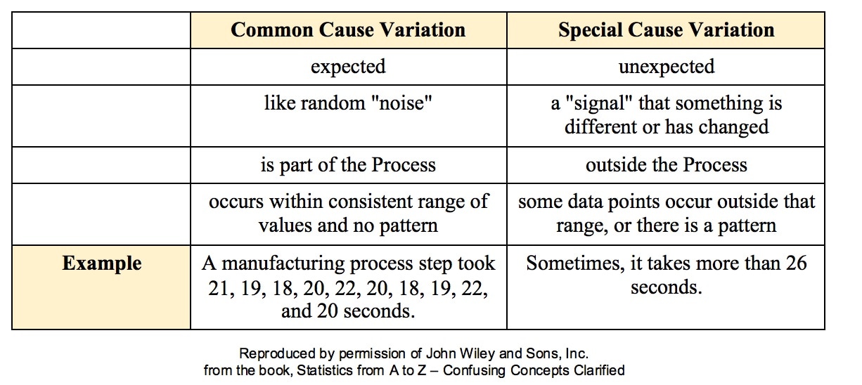 All processes have variation. A process can be said to be "under control", "stable", or "predictable" if the variation is
Such Variation is called Common Cause Variation; it is like random "noise" within an under-control process. Variation which is not Common Cause is called Special Cause Variation. It is a signal that factors outside the process are affecting it. Any Special Cause Variation must be eliminated before one can attempt to narrow the range of Common Cause Variation. Until we eliminate Special Cause Variation, we don't have a process that we can improve. There are factors outside the process which affect it, and that changes the actual process that is happening in ways that we don't know. Once we know that we have Special Cause Variation, we can use various Root Cause Analysis methods to identify the Special Cause, so that we can eliminate it. Only then can we use process/ quality improvement methods like Lean Six Sigma to try to reduce the Common Cause Variation. Here are some examples of Special Causes of Variation:
Here is an example of a Control Chart. Each point is the Mean of a small Sample of data. The Upper Control Limit (UCL) and the Lower Control Limit (LCL) are usually set at 3 Standard Deviations from the Center Line. 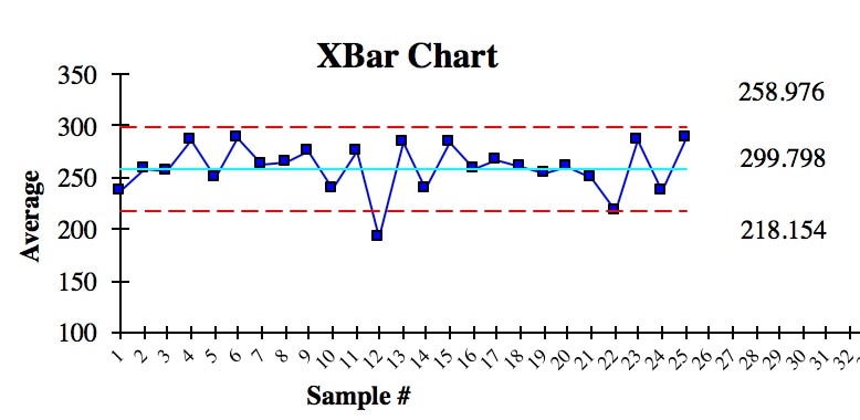 We see that there is one anomalous Sample Mean outside the Control Limits. This is due to Special Cause Variation. So, we need to do some root cause analysis to determine what caused that. And we need to make changes to eliminate it, before we can try to narrow the range of the Control Limits.
In addition to being within Control Chart limits, the data must be random. There are a number of Run Rules which describe patterns which are not random. Some patterns are not always easy to spot by eyeballing charts. Fortunately, the same software which produces Control Charts will usually also identify patterns described by the Run Rules. Here are some common patterns which indicate non-random (Special Cause) Variation. A Sigma is a Standard Deviation.
Reproduced by permission of John Wiley and Sons, Inc. from the book, Statistics from A to Z – Confusing Concepts Clarified |
AuthorAndrew A. (Andy) Jawlik is the author of the book, Statistics from A to Z -- Confusing Concepts Clarified, published by Wiley. Archives
March 2021
Categories |

 RSS Feed