|
I just uploaded a new video on the book's You Tube channel: Control Chart Part 2 of 2 -- which to use when. I'm not sure at this point what will come next. But I'll announce it on this blog. 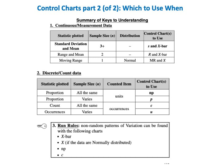 A Line Chart uses lines to connect points that have adjacent values on the horizontal axis. 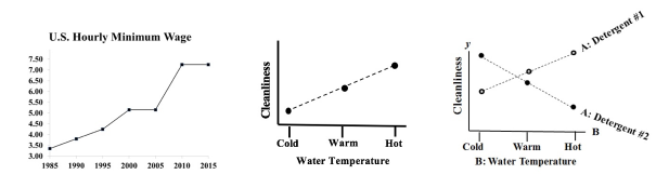 It is often used to illustrate trends, with the horizontal axis representing time.
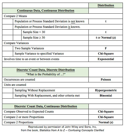
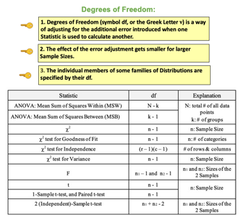
It is also used to graph cause-and-effect, in which the x Variable (horizontal axis) is the Factor which causes the effect in the y Variable (vertical axis). In the center chart above, an increase in the Factor Variable, water temperature, causes an increase in the Effect Variable, cleanliness. This is used in Regression analysis and in the Designed Experiments which are conducted to test a Regression Model. The rightmost chart combines two line charts into one. It has the same x and y Variables as the center chart, but it adds a second Factor (x) Variable, Detergent type. So, there are two lines, connecting two sets of data points. In 2-Way ANOVA, crossing lines indicate that there is an Interaction between the two Factors. In this case, an increase in temperature has the opposite effect for the two detergent types – it makes Detergent #1 do better, and it makes Detergent #2 do worse. If the lines were parallel or did not cross, then there would be no Interaction. In a similar fashion, a Line Chart can help differentiate between Observed and Expected Frequencies in a Chi-Square test for Goodness of Fit. Reproduced by permission of John Wiley and Sons, Inc. from the book, Statistics from A to z -- Confusing Concepts Clarified I just uploaded a new video to YouTube: youtu.be/zr-zP_jmPhQ This video explains the general concepts of Control Charts, which are used in process statistics (as in the Six Sigma discipline). 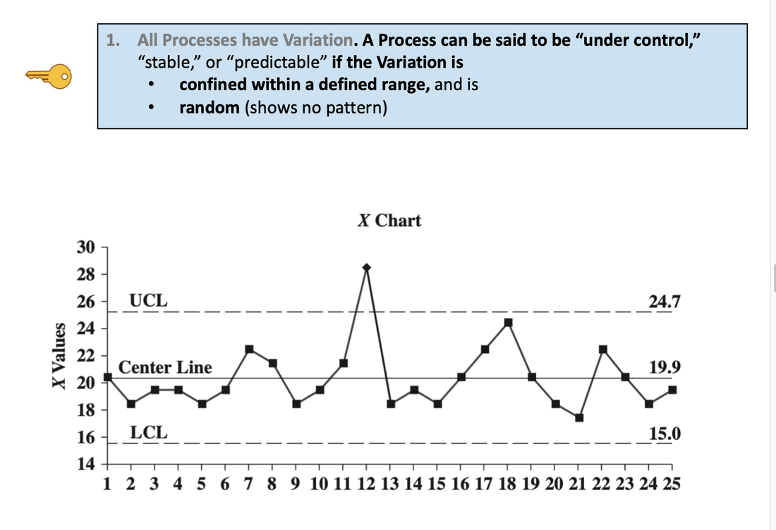 A "Statistic" is a measure of a property of a Sample, for example the Sample Mean or Sample Standard Deviation. The corresponding term for a Population or Process is "Parameter". The most commonly used statistical tests are "Parametric", that is, they require that one or more Parameters meet certain conditions or "assumptions". Most frequently, the assumption is that the Distribution of the Population or Process is roughly Normal. Roughly equal Variance is also a common assumption. If these conditions are not met, the Parametric test cannot be used, and a Nonparametric test must be used instead. This table shows the Nonparametric test that can be used in place of several common Parametric tests. 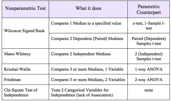 A Statistic is a numerical property of a Sample, for example, the Sample Mean or Sample Variance. A Statistic is an estimate of the corresponding property (“Parameter”) in the Population or Process from which the Sample was drawn. Being an estimate, it will likely not have the exact same value as its corresponding population Parameter. The difference is the error in the estimation. So, if we calculate a Statistic entirely from data values, there is a certain amount of error. For example, the Sample Mean is calculated entirely from the values of the Sample data. It is the sum of all the data values in the Sample divided by the number, n, of items in the Sample. There is one source of error in its formula – the fact that it is an estimate because it does not use all the data in the Population or Process. 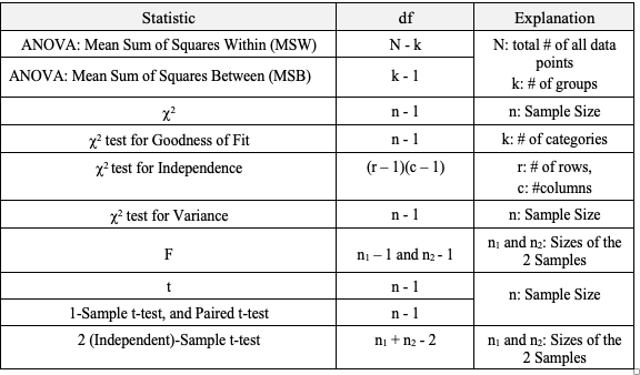 Another way that Degrees of Freedom is described is "The number of independent pieces of information that go into the calculation of a Statistic." To illustrate, let's say we have a Sample of n = 5 data values: 2, 4, 6, 8, and 10. When we calculate the Sample Mean, we have 5 independent pieces of information – the five values of the data. They are independent because none of the values are dependent on the values of another. So, for the Mean, df = 5 Sample Mean = (2 + 4 + 6 + 8 + 10) / 5 = 30 / 5 = 6 But, when we calculate the Sample Variance, we use the Mean as well as the 5 data values. The Mean is not an independent piece of information, because is it dependent on the other 5 values. Also, when we include the Mean, we only have 4 independent pieces of information left. If we know that the Mean is 30, and we have the data values 2, 4, 6, and 8, then we can calculate that the last data value has to be 10. So, 10 no longer brings independent information to the table. If we then use that Statistic to calculate another Statistic, it brings its own estimation error into the calculation of the second Statistic. This error is in addition to the second Statistic's estimation error. This happens in the case of the Sample Variance. Example: Sample Variance Numerator for Sample Variance: 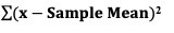 The numerator of the formula for Sample Variance includes the Sample Mean. It takes each data value (the x's) in the Sample and subtracts from it the Sample Mean. Then it sums all those subtracted values. So, the Sample Variance has two sources of error:
We don't need to make this adjustment for the Sample Mean, but we do need to do so for the Sample Variance. We divide by n – 1, instead of n. 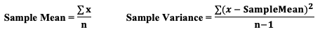 I uploaded a new video: Design of Experiments (DOE) Part 3 of 3  p is the Probability of an Alpha (False Positive) Error. Alpha (α) is the Level of Significance; its value is selected by the person performing the statistical test. If p < α (some say if p < α) then we Reject the Null Hypothesis. That is, we conclude that any difference, change, or effect observed in the Sample data is Statistically Significant. The p-value contains the same information as the Test Statistic Value, say z. That is because the value of z is used to determine the p-value. As shown in the following concept flow diagram,
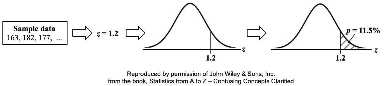 Similarly α contains the same information as the Critical Value. 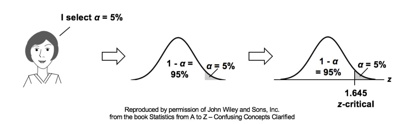 So comparing p and the Critical Value is the same as comparing Alpha and the Test Statistic value. But the comparison symbols ( ">" and "<") point in the opposite direction. That's because p and Test Statistic have an inverse relation. A smaller value for p means that the Test Statistic value must be larger. 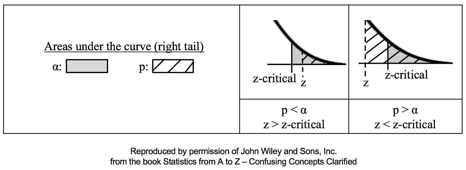 I just uploaded a new video: Design of Experiments (DOE) Part 2 of 2 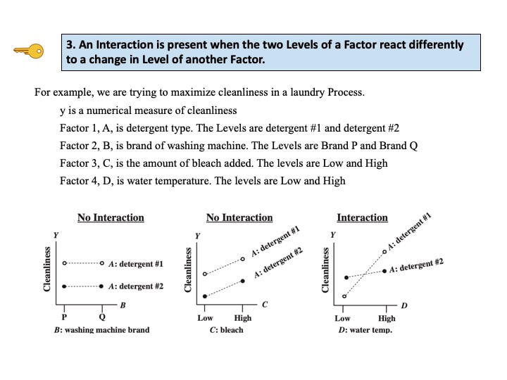 |
AuthorAndrew A. (Andy) Jawlik is the author of the book, Statistics from A to Z -- Confusing Concepts Clarified, published by Wiley. Archives
March 2021
Categories |
 RSS Feed