STATISTICS FROM A TO Z<br />-- CONFUSING CONCEPTS CLARIFIED
  • Home
    • Why This Book Is Needed
    • Articles List, Additional Concepts
    • Examples: 1-Page Summaries
    • Examples: Concept Flow Diagram
    • Examples: Compare and Contrast Tables
    • Examples: Cartoons
    • Example: Which to Use When Article
  • Buy
  • Blog
  • Sample Articles
  • Videos
  • Author
  • Communicate
  • Files
  • Errata

Statistics Tip: Which Distribution to Use When

3/30/2021

5 Comments

 
Picture
5 Comments

New Video: Control Charts -- Part 2 of 2: Which to Use When

3/28/2021

1 Comment

 
I just uploaded a new video on the book's  You Tube channel:  Control Chart Part 2 of 2 -- which to use when.
I'm not sure at this point what will come next. But I'll announce it on this blog.
Picture
1 Comment

Statistics Tip: Use a Line Chart to see Trends, Effects, or Interactions

3/4/2021

0 Comments

 
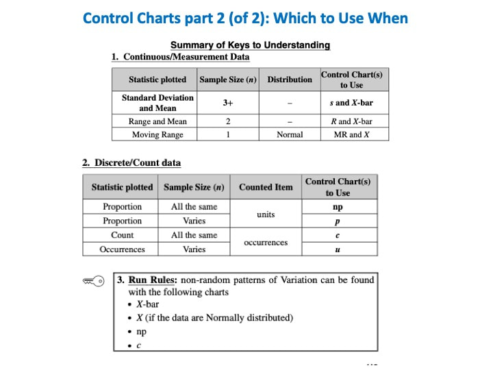
​A Line Chart uses lines to connect points that have adjacent values on the horizontal axis. 
Picture
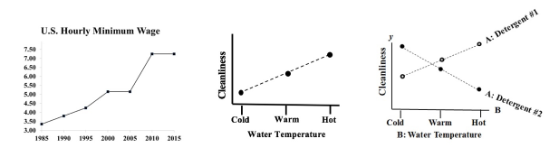
     It is often used to illustrate trends, with the horizontal axis representing time. 

     It is also used to graph cause-and-effect, in which the x Variable (horizontal axis) is the Factor which causes the effect in the y Variable (vertical axis). In the center chart above, an increase in the Factor Variable, water temperature, causes an increase in the Effect Variable, cleanliness. This is used in Regression analysis and in the Designed Experiments which are conducted to test a Regression Model. 

​     The rightmost chart combines two line charts into one. It has the same x and y Variables as the center chart, but it adds a second Factor (x) Variable, Detergent type. So, there are two lines, connecting two sets of data points. In 2-Way ANOVA, crossing lines indicate that there is an Interaction between the two Factors. In this case, an increase in temperature has the opposite effect for the two detergent types – it makes Detergent #1 do better, and it makes Detergent #2 do worse. If the lines were parallel or did not cross, then there would be no Interaction. 
In a similar fashion, a Line Chart can help differentiate between Observed and Expected Frequencies in a Chi-Square test for Goodness of Fit. 

Reproduced by permission of John Wiley and Sons, Inc. from the book,
​Statistics from A to z -- Confusing Concepts Clarified
0 Comments

New Video: "Control Charts -- Part 1 of 2"

3/1/2021

0 Comments

 
I just uploaded a new video to YouTube: youtu.be/zr-zP_jmPhQ
This video explains the general concepts of Control Charts, which are used in process statistics (as in the Six Sigma discipline).
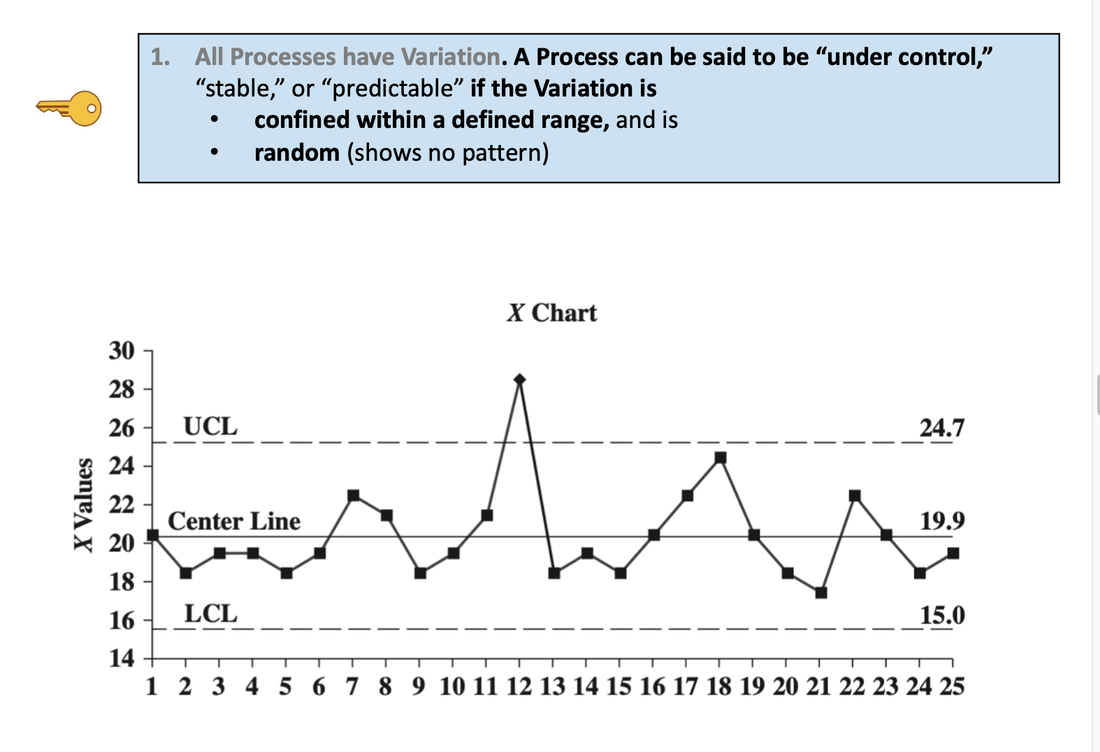
Picture
0 Comments

    Author

    Andrew A. (Andy) Jawlik is the author of the book, Statistics from A to Z -- Confusing Concepts Clarified, published by Wiley.

    Archives

    March 2021
    December 2020
    November 2020
    October 2020
    September 2020
    August 2020
    May 2020
    March 2020
    February 2020
    January 2020
    December 2019
    November 2019
    October 2019
    September 2019
    July 2019
    June 2019
    May 2019
    April 2019
    March 2019
    February 2019
    January 2019
    December 2018
    November 2018
    October 2018
    September 2018
    August 2018
    July 2018
    June 2018
    May 2018
    April 2018
    March 2018
    February 2018
    January 2018
    December 2017
    November 2017
    October 2017
    September 2017
    August 2017
    July 2017
    June 2017
    May 2017
    April 2017
    March 2017
    February 2017
    January 2017
    December 2016
    November 2016
    October 2016
    September 2016
    August 2016

    Categories

    All
    New Video
    Stats Tip Of The Week
    You Are Not Alone

    RSS Feed

  • Home
    • Why This Book Is Needed
    • Articles List, Additional Concepts
    • Examples: 1-Page Summaries
    • Examples: Concept Flow Diagram
    • Examples: Compare and Contrast Tables
    • Examples: Cartoons
    • Example: Which to Use When Article
  • Buy
  • Blog
  • Sample Articles
  • Videos
  • Author
  • Communicate
  • Files
  • Errata