|
It's been said that the first 3 laws of statistics are: 1. Plot the data. 2. Plot the data. 3. Plot the data. Others say the same thing using different words: 1. Draw a picture. 2. Draw a picture. 3. Draw a picture. Let's say we have a couple of sets of (x,y) data, and we want to fit Regression models to them. For Simple Linear Regression, we would first have to establish a Linear Correlation. If we just calculated the Correlation Coefficient, r, it would tell us that both the datasets graphed below have a very strong Linear Correlation. 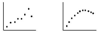 We can see how that would apply for the data set pictured on the left. But the one on the right is definitely not linear. We would be better off with non-linear regression, using a Polynomial model.
This kind of thing happens more frequently than one might think. So, always plot the data first; calculated statistics alone can be misleading. And a picture of the data helps give you a more intuitive understanding of the data that you are analyzing.
1 Comment
 This new video: https://youtu.be/vyX4m89VkyI
YouTube Channel for this book: http://bit.ly/2dD5H5f This is the first of 5 videos planned for a playlist on 4 central concepts in Inferential Statistics:
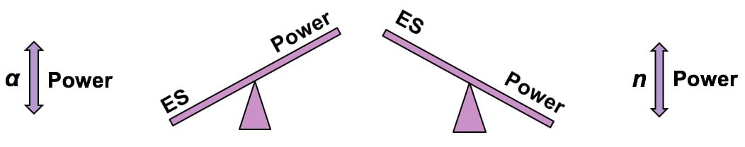 In an Inferential Statistics test, a Beta Error is a "False Negative" (in contrast to an Alpha Error, which is a "False Positive"). Power is the Probability of not making a Beta Error. It is the Probability of correctly concluding that there is not a Statistically Significant difference, change, or effect. Put another way, Power is the Probability of accepting (Failing to Reject) the Null Hypothesis, when the Null Hypothesis is true.
Power is directly affected by Alpha, the Level of Significance, and n, the Sample Size. If we want to increase the Power of a test, the best way is to increase the Sample Size, n. We could also increase Alpha. Alpha is the value we select as the maximum Probability of an Alpha Error which we will tolerate and still call the results "Statistically Significant". So, if we're willing to tolerate a higher Probability of an Alpha Error, we can reduce the Probability of a Beta Error. This is illustrated in my blog post on the Alpha Error and Beta Error see-saws. As the two see-saws in the middle of the graphic above demonstrate, Power has an inverse relationship with Effect Size (ES). If we want our test to be able to detect small Effect Sizes, then we need to have a high value for Power. As we just said, we can get this by increasing the Sample Size, n, or increasing our tolerance for an Alpha Error. The 2nd see-saw above shows that if we have low Power, then the detectable Effect Size will be high.  I don't know what mathematicians think. But I have been struck by inconsistencies in terminology and by disagreement about fundamental concepts among experts in statistics.
For example, I was watching a video in which a professor kept mentioning "scatter". I had no idea what he was talking about, but eventually it became clear that "scatter" was the same thing as "variation" -- which is also known as "variability", "dispersion", and "spread". That's 5 terms for one concept. Here's another example: in the equation y = f(x), y is variously known as the
SST = SSR (Sum of Squares Regression) + SSE (Sum of Squares Error) But one author (at least) uses "SST" (Sum of Squares Treatment) instead of "SSR" -- which is very confusing. (I forget what they renamed Sum of Squares Total.) And experts disagree about some very basic concepts. For example:
 Had my first author talk and book signing today -- at my hometown Ridgefield CT Library. Good turnout - 41 people. Lots of good questions. Signed and sold some books for Books on the Common. See the Files page for the presentation slides.
The Binomial Distribution is used with Count data. It displays the Probabilities of Count data from Binomial Experiments. In a Binomial Experiment,
There are many Binomial Distributions. Each one is defined by a pair of values for two Parameters, n and p. n is the number of trials, and p is the Probability of each trial. The graphs below show the effect of varying n, while keeping the Probability the same at 50%. The Distribution retains its shape as n varies. But obviously, the Mean gets larger. 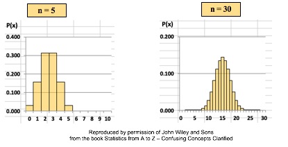 The effect of varying the Probability, p, is more dramatic. 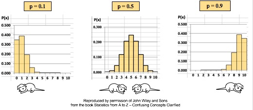 For small values of p, the bulk of the Distribution is heavier on the left. However, as described in my blog post of October 4, statistics describes this as being skewed to the right, that is, having a positive skew. (The skew is in the direction of the long tail.) For large values of p, the skew is to the left, because the bulk of the Distribution is on the right.
Variation is also known as "Variability", "Dispersion", "Spread", and "Scatter". (5 names for one thing is one more example why statistics is confusing.) Variation is 1 of 3 major categories of measures describing a Distribution or data set. The others are Center (aka "Central Tendency") with measures like Mean, Mode, and Median and Shape (with measures like Skew and Kurtosis). Variation measures how "spread out" the data is. 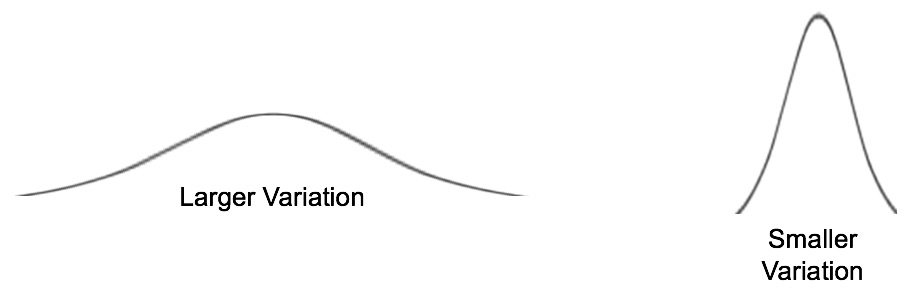 There are a number of different measures of Variation. This compare-and-contrast table shows the relative merits of each. 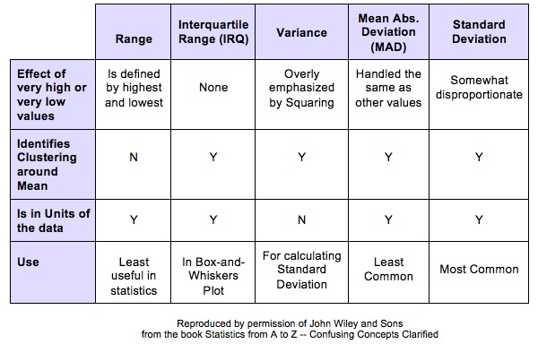
|
AuthorAndrew A. (Andy) Jawlik is the author of the book, Statistics from A to Z -- Confusing Concepts Clarified, published by Wiley. Archives
March 2021
Categories |

 RSS Feed