|
In an earlier Tip, we said that a Histogram was good for picturing the shape of the data. What a Histogram is not good for is picturing Variation -- as measured by Standard Deviation or Variance. The size of the range for each bar is purely arbitrary. Larger ranges would make for fewer bars and a narrower picture. Also, the width of the bars in the picture can be varied, making the spread appear wider or narrower. A Dot Plot can be used to picture Variation if the number of data points is relatively small. Each individual point is shown as a dot, and you can show exactly how many go into each bin. 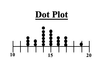 Boxplots, also known as Box and Whiskers Plots can very effectively provide a detailed picture of Variation. In an earlier Statistics Tip, we showed how several Box and Whiskers Plots can enable you to visually choose the most effective of several treatments. Here's an illustration of the anatomy of a Box and Whiskers Plot 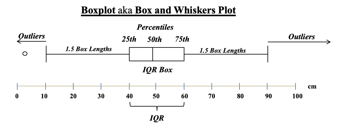 In the example above, the IQR box represents the InterQuartile Range, which is a useful measure of Variation. This plot shows us that 50% of the data points (those between the 25th and 75th Percentiles) were within the range of 40 – 60 centimeters. 25% were below 40 and 25% were above 60. The Median, denoted by the vertical line in the box is about 48 cm.
Any data point outside 1.5 box lengths from the box is called an Outlier. Here, the outlier with a value of 2 cm. is shown by a circle. Not shown above, but some plots define an Extreme Outlier as one that is more than 3 box lengths outside the box. Those can be shown by an asterisk
0 Comments
Leave a Reply. |
AuthorAndrew A. (Andy) Jawlik is the author of the book, Statistics from A to Z -- Confusing Concepts Clarified, published by Wiley. Archives
March 2021
Categories |
 RSS Feed