|
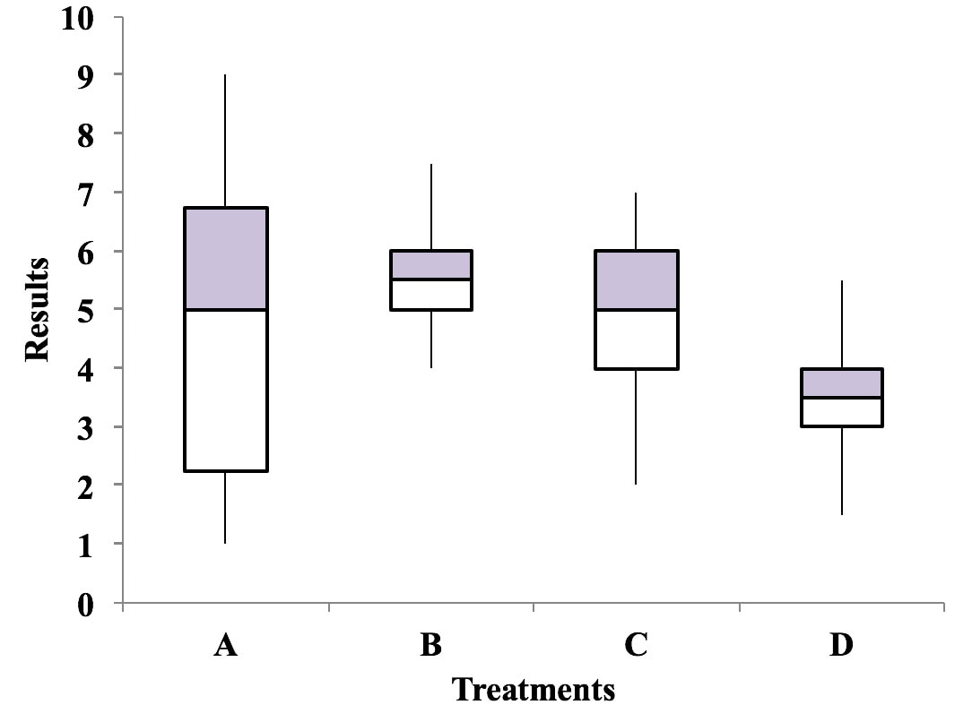
A Boxplot, also known as Box and Whiskers Plot, is a good way to visually depict Variation in a dataset (e.g., a Sample or Population). And showing several Boxplots vertically is useful for comparing Variation among several datasets. The boxes depict the range within which 50% of the data falls for each dataset.
In this illustration, a higher score is better. Treatment A has the highest individual score, but it has considerable more Variation in results than Treatments B and C. The Medians for Treatments A, B, and C are fairly close. So, we can see at a glance that Treatment D can be eliminated from consideration. Treatment B has the highest Median and is gives very consistent results (small Variation). So, this plot may be all we need to select B as the best treatment.
0 Comments
Leave a Reply. |
AuthorAndrew A. (Andy) Jawlik is the author of the book, Statistics from A to Z -- Confusing Concepts Clarified, published by Wiley. Archives
March 2021
Categories |


 RSS Feed