|
In the Tip for September 8, 2018, we listed a number of things that ANOVA can and can't do. One of these was that ANOVA can tell us whether or not there is a Statistically Significant difference among several Means, but it cannot tell us which ones are different from the others to a Statistically Significant amount. Let's say we're comparing 3 Groups (Populations or Processes) from which we've taken Samples of data. ANOM calculates the Overall Mean of all the data from all Samples, and then it measures the variation of each Group Mean from that. In the conceptual diagram below, each Sample is depicted by a Normal curve. The distance between each Sample Mean and the Overall Mean is identified as a "variation". 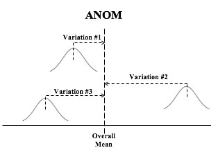 ANOM retains the identity of the source of each of these variations (#1, #2, and #3), and it displays this graphically in an ANOM chart like the one below. In this ANOM chart, we are comparing the defect rates in a Process at 7 manufacturing plants. 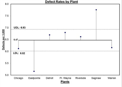 The dotted horizontal lines, the Upper Decision Line, UDL and Lower Decision Line, LDL, define a Confidence Interval, in this case, for α = 0.05. Our conclusion is that only Eastpointe (on the low side) and Saginaw (on the high side) exhibit a Statistically Significant difference in their Mean defect rates. So ANOM tells us not only whether any plants are Significantly different, but which ones are. In ANOVA, however, the individual identities of the Groups are lost during the calculations. 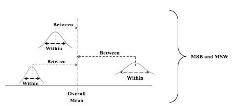 The 3 individual variations Betweenthe individual Means and the Overall Mean are summarized into one Statistic, MSB, the Mean Sum of Squares Between. And the 3 variations Within each Group are summarized into another Statistic, MSW, the Mean Sum of Squares Within. 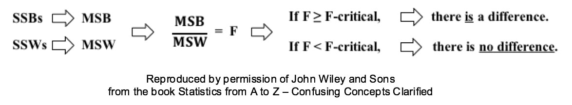
0 Comments
4 Keys to Understanding and illustrated examples help you gain an intuitive understanding of this concept. https://youtu.be/VYCibUmLUic  This is the 4th video in a planned playlist on Statistical Tests. See the Videos page on this website for a list of the available and planned videos.
You can't use Linear Regression unless there is a Linear Correlation. The following compare-and-contrast table may help in understanding both concepts. 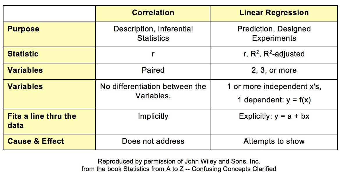 Correlation analysis describesthe present or past situation. It uses Sample data toinfera property of the source Population or Process. There is no looking into the future. The purpose of Linear Regression, on the other hand, is to define a Model (a linear equation) which can be used to predict the results of Designed Experiments.
Correlation mainly uses the Correlation Coefficient, r. Regression also uses r, but employs a variety of other Statistics. Correlation analysis and Linear Regression both attempt to discern whether 2 Variables vary in synch. Linear Correlation is limited to 2 Variables, which can be plotted on a 2-dimensional x-y graph. Linear Regression can go to 3 or more Variables/ dimensions. In Correlation, we ask to what degree the plotted data forms a shape that seems to follow an imaginary line that would go through it. But we don't try to specify that line. In Linear Regression, that line is the whole point. We calculate a best-fit line through the data: y = a + bx. Correlation Analysis does not attempt to identify a Cause-Effect relationship, Regression does. I just uploaded a new video: https://youtu.be/ba1FwMcNQuY  The Central Limit Theorem (CLT) is a powerful concept, because it enables us to use the known Probabilities of the Normal Distribution in statistical analyses of data which are not Normally distributed. It is most commonly known as applying to the Means of Samples of data. 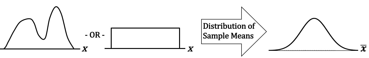 The data can be distributed in any way. For example -- as shown above -- it can be double-peaked and asymmetrical, or it can have the same number of points for every value of x. If we take many sufficiently large Samples of data with any Distribution, the Distribution of the Means (x-bar)'s of these Samples will be approximate the Normal Distribution. There is something intuitive about the CLT. The Mean of a Sample taken from any Distribution is very unlikely to be at the far left or far right of the range of the Distribution. Means (averages), by their very definition, tend to average-out extremes. So, their Probabilities would be highest in the center of a Distribution and lowest at the extreme left or right. Less intuitively obvious is that the CLT applies to Proportions as well as to Means. 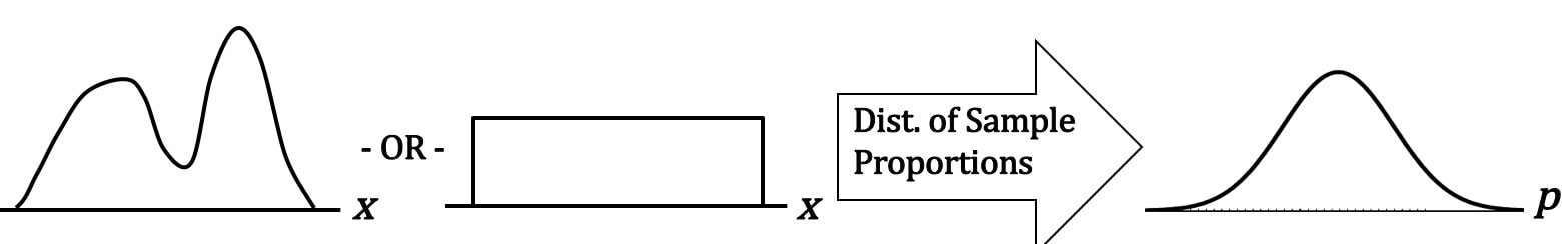 Let's say that pis the Proportion of the count of a category of items in a Sample, say the Proportion of green jelly beans in a candy bin. We take many Samples, with replacement, of the same size n, and we calculate the Proportion for each Sample. When we graph these Proportions, they will approximate a Normal Distribution. How large of a Sample Size, n, is "sufficiently large"? It depends on the use and the statistic. For Means and most uses n > 30 is considered large enough. But for Proportions, it's a little more complicated -- it depends on what the value of p is. n is large enough if np > 5 and n(1 - p) > 5. The practical effect of this is:
This table gives us the specifics; the minimum Sample Size, n, is shown in the middle row. 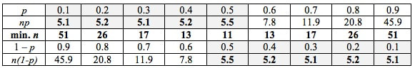 6 Keys to understanding and plenty of concept flow diagrams and other visual aids help the viewer gain a good understanding if these concepts. https://youtu.be/9llhdO8pB-4. For the latest status of available and planned videos, see the videos page in this website. 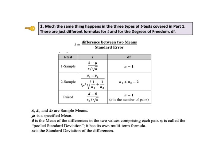 In determining which Distribution to use in analyzing Discrete (Count) data, we need to know whether we are interested in Occurrences or Units. Let's say we are inspecting shirts at the end of the manufacturing line. We may be interested in the number of defective Units – shirts, because any defective shirt is likely to be rejected by our customer. However, one defective shirt can contain more than one defect. So, we are also interested in the Count of individual defects – the Occurrences – because that tells us how much of a quality problem we have in our manufacturing process.  For example, if 1 shirt has 3 defects, that would be 3 Occurrences of a defect, but only 1 Unit counted as defective.
We would use the Poisson Distribution in analyzing Probabilities of Occurrences of defects. To analyze the Probability of Units, we could use the Binomial or the Hypergeometric Distribution. There is an article in the book focusing on the Poisson Distribution. There is also a video, on my YouTube channel, Statistics from A to Z. These are all terms used in Correlation and Linear Regression (Simple and Multiple). And some of these terms have several names. I don't know about you, but I get confused trying to keep them all straight. So I wrote this compare-and-contrast table, which should help. 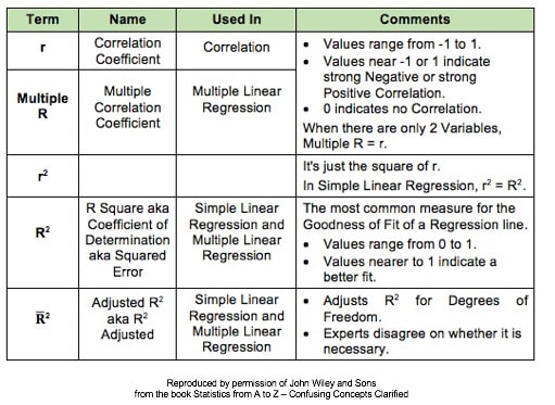 First in a playlist on Statistical Tests. 5 Keys to Understanding and compare-and- contrast tables, help the viewer understand the 3 different types of parametric t-tests. https://youtu.be/ZJlrF_yfiPo. For a complete listing of available and planned videos, please see the Videos page on this website.  |
AuthorAndrew A. (Andy) Jawlik is the author of the book, Statistics from A to Z -- Confusing Concepts Clarified, published by Wiley. Archives
March 2021
Categories |


 RSS Feed