|
In Regression, we attempt to fit a line or curve to the data. Let's say we're doing Simple Linear Regression in which we are trying to fit a straight line to a set of (x,y) data. We test a number of subjects with dosages from 0 to 3 pills. And we find a straight line relationship, y = 3x, between the number of pills (x) and a measure of health of the subjects. So, we can say this. 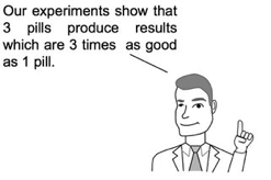 But we cannot make a statement like the following: 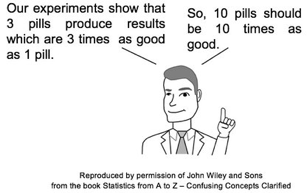 This is called extrapolating the conclusions of your Regression Model beyond the range of the data used to create it. There is no mathematical basis for doing that, and it can have negative consequences, as this little cartoon from my book illustrates. 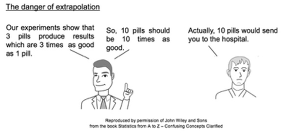 In the graphs below, the dots are data points. In the graph on the left, it is clear that there is a linear correlation between the drug dosage (x) and the health outcome (y) for the range we tested, 0 to 3 pills. And we can interpolate between the measured points. For example, we might reasonably expect that 1.5 pills would yield a health outcome halfway between that of 1 pill and 2 pills. 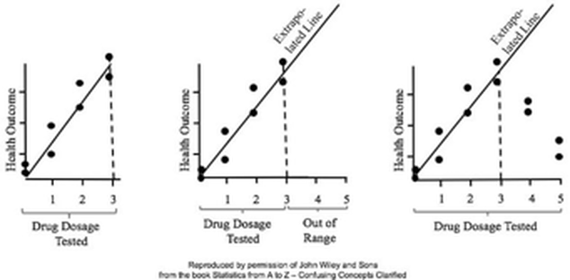 For more on this and other aspects of Regression, you can see the YouTube videos in my playlist on Regression. (See my channel: Statistics from A to Z - Confusing Concepts Clarified.
1 Comment
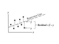 This is the 9th and final video in my channel on Regression. Residuals represent the error in a Regression Model. That is, Residuals represent the Variation in the outcome Variable y, which is not explained by the Regression Model. Residuals must be analyze several ways to ensure that they are random, and that they do no represent the Variation caused by some unidentified x-factor.
See the videos page in this website for a listing of available and planned videos. The Binomial Distribution is used with Count data. It displays the Probabilities of Count data from Binomial Experiments. In a Binomial Experiment,
There are many Binomial Distributions. Each one is defined by a pair of values for two Parameters, n and p. n is the number of trials, and p is the Probability of each trial. The graphs below show the effect of varying n, while keeping the Probability the same at 50%. The Distribution retains its shape as n varies. But obviously, the Mean gets larger. 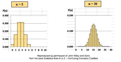 The effect of varying the Probability, p, is more dramatic. 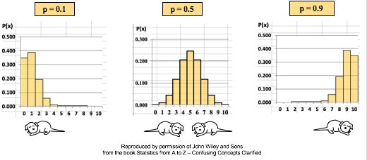 For small values of p, the bulk of the Distribution is heavier on the left. However, as described in my post of July 25, 2018, statistics describes this as being skewed to the right, that is, having a positive skew. (The skew is in the direction of the long tail.) For large values of p, the skew is to the left, because the bulk of the Distribution is on the right.
New video: Simple Nonlinear Regression. 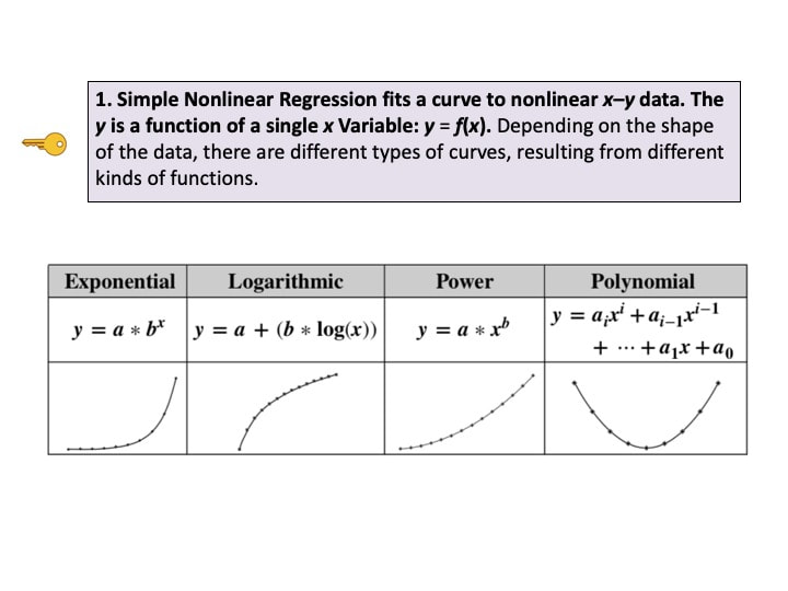 This is the 7th in a playlist on Regression. For a complete list of my available and planned videos, please see the Videos page on this website.
Variation is also known as "Variability", "Dispersion", "Spread", and "Scatter". (5 names for one thing is one more example why statistics is confusing.) Variation is 1 of 3 major categories of measures describing a Distribution or data set. The others are Center (aka "Central Tendency") with measures like Mean, Mode, and Median and Shape (with measures like Skew and Kurtosis). Variation measures how "spread out" the data is. 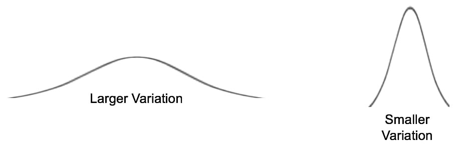 There are a number of different measures of Variation. This compare-and-contrast table shows the relative merits of each. 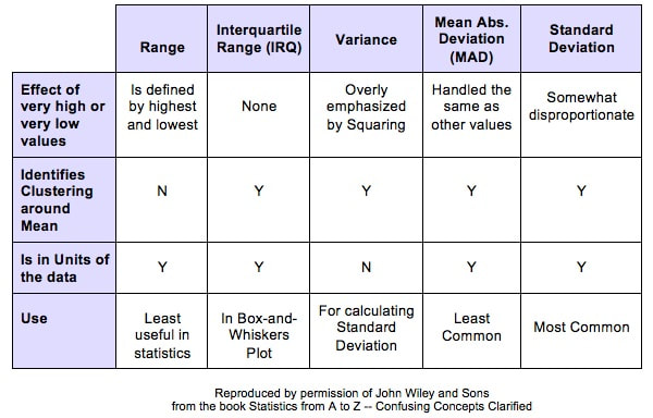
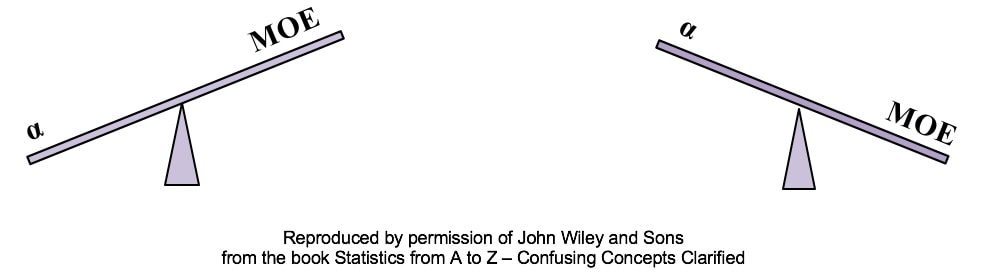 Alpha is the Significance Level of a statistical test. We select a value for Alpha based on the level of Confidence we want that the test will avoid a False Positive (aka Alpha aka Type I) Error. In the diagrams below, Alpha is split in half and shown as shaded areas under the right and left tails of the Distribution curve. This is for a 2-tailed, aka 2-sided test. 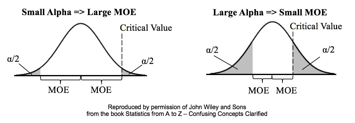 In the left graph above, we have selected the common value of 5% for Alpha. A Critical Value is the point on the horizontal axis where the shaded area ends. The Margin of Error (MOE) is half the distance between the two Critical Values.
A Critical Value is a value on the horizontal axis which forms the boundary of one of the shaded areas. And the Margin of Error is half the distance between the Critical Values. If we want to make Alpha even smaller, the distance between Critical Values would get even larger, resulting in a larger Margin of Error. The right diagram shows that if we want to make the MOE smaller, the price would be larger Alpha. This illustrates the Alpha - MOE see-saw effect. But what if we wanted a smaller MOE without making Alpha larger? Is that possible? It is -- by increasing n, the Sample Size. (It should be noted that, after a certain point, continuing to increase n yields diminishing returns. So, it's not a universal cure for these errors.) If you'd like to learn more about Alpha, I have 2 YouTube videos which may be of interest: Continuing the playlist on Regression, I have uploaded a new video to YouTube: Regression -- Part 4: Multiple Linear. There are 5 Keys to Understanding, here is the 3rd. See the Videos pages of this website for more info on available and planned videos. 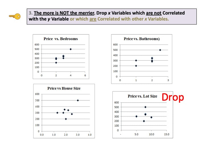 Categorical Variables are used in ANOMA, ANOVA, with Proportions, and in the Chi-Square Tests for Independence and Goodness of Fit. Categorical Variables are also known as "Nominal" (named) Variables and "Attributes" Variables. The concept can be confusing, because the values of a Categorical Variable are not numbers, but names of categories. The numbers associated with Categorical Variables come from counts of the data values within a named category. Here's how it works: 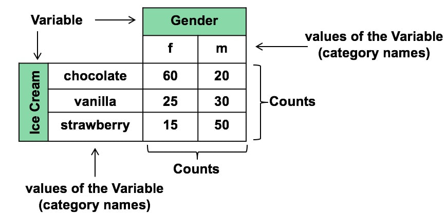
|
AuthorAndrew A. (Andy) Jawlik is the author of the book, Statistics from A to Z -- Confusing Concepts Clarified, published by Wiley. Archives
March 2021
Categories |


 RSS Feed