Statistics Tip of the Week: Simple Non-linear Regression fits a curve to non-linear x,y data.8/22/2017 The "Simple" means that there is only one x variable. y = f(x). So the curve exists in two dimension and can be plotted on screen or sheet of paper. The "non-linear" means that, when we graph the data, it does not roughly follow a straight line, so we must look for an appropriate curve. The following are probably the most common non-linear curves used: 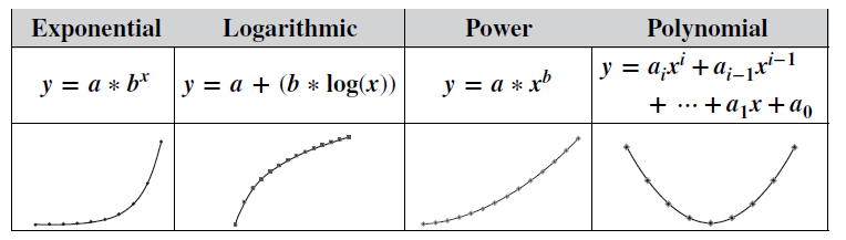 Exponential and Logarithmic curves have rapid accelerations or decelerations
in the slope. Power curves have a more gradual change. Polynomial functions can be used for more complex curves, which change direction, as shown in our Tip of the Week for May 17, 2017
0 Comments
Statistics Tip of the Week: an Exponential Distribution can be used with problems involving time.8/17/2017 The Exponential Distribution is useful for solving problems involving time to an event or time between events -- for example, time between emergency calls or time between equipment failures. It is especially useful with events that are relatively rare. If one were to analyze rare events per time period, using the Poisson Distribution, for example, the Counts might include a lot of zeros and an occasional 1. It may be more meaningful to think in terms of the time between events and measure the data that way. Then the Exponential Distribution could be used. 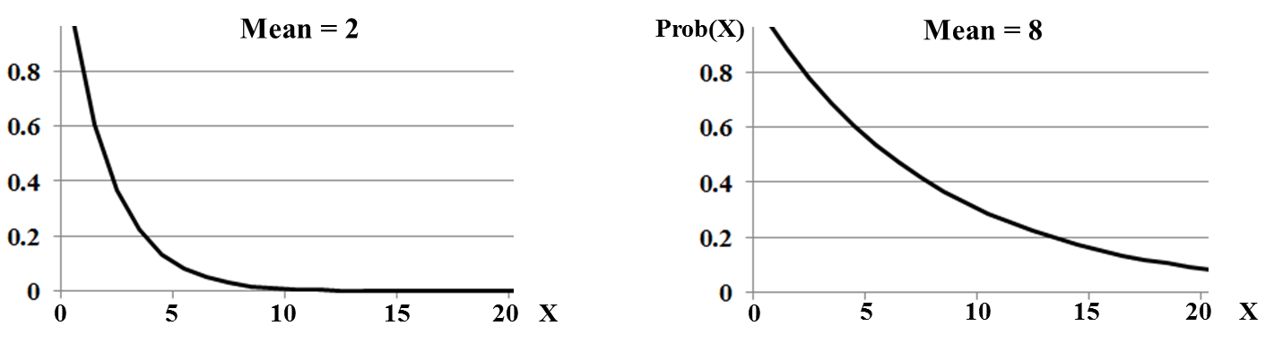 An individual Exponential Distribution can be specified by just one Parameter – either the Mean (µ), or the Rate (λ). λ = 1/ µ (If the Mean time to an event is 8 hours, then the Rate at which the events occur is 1/8 per hour.) An interesting fact about all Exponential Distributions: The Mean always splits the Cumulative Probabilities (areas under the curve) into 63% and 37%. 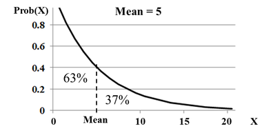 In our March 2, 2017 Tip of the Week, we discussed 2-Factor (aka 2-Way) ANOVA. We said that:
 For example, in the left diagram, above, both detergents behave the same way to a change in water temperature -- they show no change in their Effect -- cleanliness. Likewise, the middle and right diagrams show both detergents behaving the same -- a parallel increase in Effect. But what if we got something like the two graphs below? In the example at left, Detergent #1 shows a substantial increase in effectiveness as the water temperature is increased. But for Detergent #2, heating the water has the opposite effect: its effectiveness is decreased.  In the example on the right, both detergents show an increase in effectiveness as water temperature increases. But Detergent #2's increase is fairly minor. In fact, its increase may not be Statistically Significant and the Interaction may not be Statistically Significant..
In either case, we do have reason to suspect an Interaction. so 2-Way ANOVA Without Replication cannot be used. We must use 2-Way ANOVA With Replication. The With Replication method repeats (Replicates) the experiment several times for each combination of Factor A and B Values. This can provide sufficient data to quantify an Interaction. The number of Replications required to achieve a specified level of accuracy is determined by the methods of Design of Experiments, DOE. The Design also specifies the levels of each Factor to be used in each replication, the order of replication and other specifics of the experiment. The book has a 3-part series on DOE, and eventually there may be a video series on it as well. There is currently a video on the book's YouTube channel with more information about the subject of this post: ANOVA -- Part 4 (of 4): 2-Way (aka 2-Factor).  In our November 17, 2016 Tip of the Week, we showed how the concept of Alpha leads to the concept of Critical Value. This Tip shows how that, in turn, leads to the Critical Value. 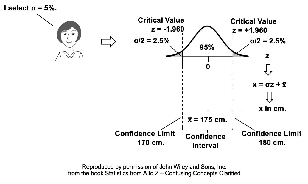
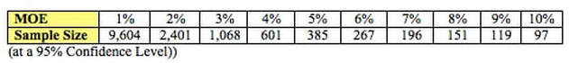 This may be a handy table to keep around somewhere. How big a Sample Size do we need if we want to differentiate between 2 choices in a survey or election? It's more than people usually think.
Some might have in mind the guidance on when to use the t Distribution instead of the z (Standard Normal) Distribution. We're told we can use z when n, the Sample Size, is "large". And then we learn that some consider 30 to be large enough, while others say 100. But as you can see from this table, n = 100 barely gets you into the game when you're doing a survey or poll. When n = 100, you have a 10% Margin of Error (MOE). That is, you can say that you have a Statistically Significant difference if your Proportions are wider spread than 44% and 55% for the 2 candidates. But to get to a 2% MOE, you'd need a Sample Size of 2,400. Notice also, that diminishing returns set in. To get to a 1% MOE, you'd need a sample 4 times larger than you would for 2%. In Hypothesis Testing, "Fail to Reject the Null Hypothesis" is one of two possible conclusions to be drawn from the test. The other is "Reject the Null Hypothesis." We are all taught in elementary school to avoid using double negatives, like "I don't have no money." However, statistics goes beyond the double negative to an even more confusing triple negative: "Fail to Reject the Null Hypothesis." Fail, Reject, and Null are all negative words This is like saying, "I don't not have no money." 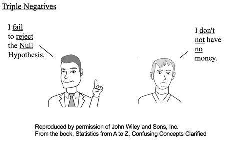 That statement confuses a lot of people. It may help to understand better if we represent a positive statement by +1 and a negative by -1. In Hypothesis Testing, we are usually trying to determine whether there is a Statistically Significant difference, change, or effect. 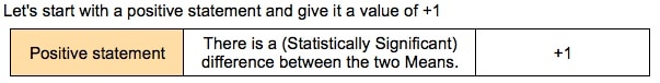 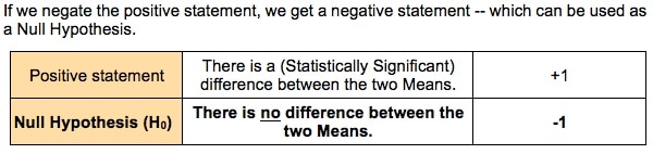 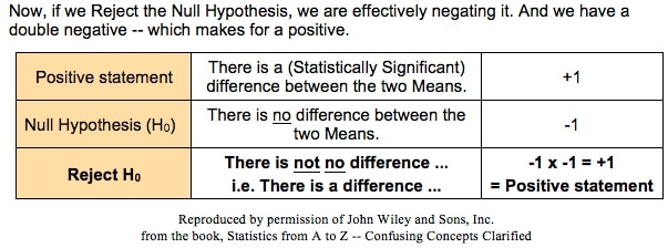 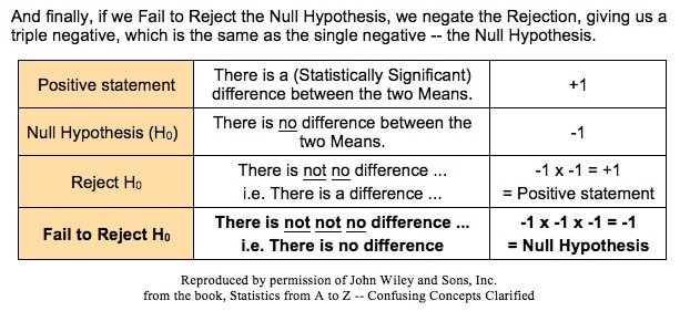 For more on how to clarify this confusing concept, please see my video, Fail to Reject the Null Hypothesis. It has received very good reviews, like these:  In earlier blog posts, we've seen how different types of charts can be used in different ways to increase our understanding of the data and to communicate that understanding to others:
Here's another example: a Line Chart uses lines to connect points that have adjacent values on the horizontal axis. It is often used to illustrate trends, with the horizontal axis representing time.  It is also used to graph cause-and-effect, in which the x Variable (horizontal axis) is the Factor which causes the Effect in the y Variable (vertical axis). In the chart below, an increase in the Factor Variable, water temperature, causes an increase in the Effect Variable, cleanliness. This is used in Regression analysis and in the Designed Experiments which are conducted to test a Regression Model. 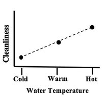 The following chart combines two line charts into one. It has the same x and y Variables as the previous chart, but it adds a second Factor (x) Variable, Detergent. So, there are two lines, connecting two sets of data points. In 2-Way ANOVA, crossing lines indicate that there is an Interaction between the two Factors. In this case, an increase in temperature has the opposite effect for the two detergent types – it makes Detergent #1 do better, and it makes Detergent #2 do worse. If the lines were parallel or did not cross, then there would be no Interaction. 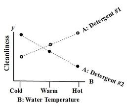 In a similar fashion, a Line Chart can help differentiate between Observed and Expected Frequencies in a Chi-Square test for Goodness of Fit. Reproduced by permission of John Wiley and Sons, Inc.
from the book, Statistics from A to Z -- Confusing Concepts Clarified A "Statistic" is a measure of a property of a Sample, for example, the Sample Mean or Sample Standard Deviation. The corresponding term for a Population or Process is "Parameter". The most commonly used statistical tests are "Parametric", that is, they require that one or more Parameters meet certain conditions or "assumptions". Most frequently, the assumption is that the Distribution of the Population or Process is roughly Normal. Roughly equal Variance is also a common assumption. If these conditions are not met, the Parametric test cannot be used, and a Nonparametric test must be used instead. This table shows the Nonparametric test that can be used in place of several common Parametric tests. 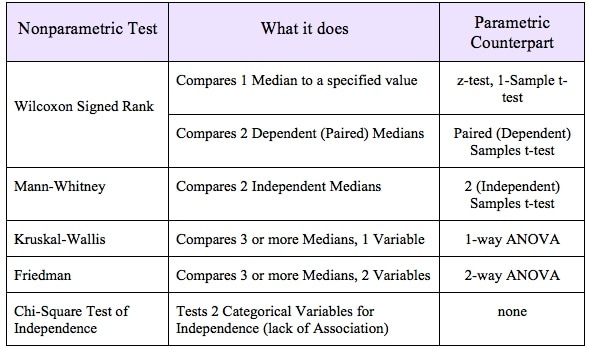 |
AuthorAndrew A. (Andy) Jawlik is the author of the book, Statistics from A to Z -- Confusing Concepts Clarified, published by Wiley. Archives
March 2021
Categories |

 RSS Feed