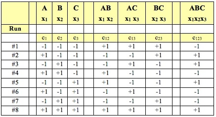
Statistics Tip of the Week: Designed Experiments provide strong evidence of cause and effect.5/25/2017 For a Process output, y, which is a function of several Factors (x's), that is, for 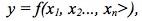 the Design of Experiments (DOE) discipline can design the most efficient and effective experiments to determine the values of the x's which produce the optimal value for -- or the minimal Variation in -- the Response Variable, y. DOE is active and controlling. (This can be done with Processes, but usually not with Populations). DOE doesn’t collect or measure existing data with pre-existing values for y and the x’s. DOE specifies Combinations of values for inputs (Factors) and then measures the resulting values of the outputs (Responses). This is the Design of the Experiment. Statistical software packages perform DOE calculations which specify the elements which make up the Design:
0 Comments
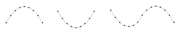 The "Simple" in "Simple Nonlinear" means that there is only one x Variable in the formula of the formula e.g. y = f(x). The "nonlinear" means that we have determined that a straight line will not fit the data. We need to use some kind of curve -- e.g. Exponential, Logarithmic, Power, Polynomial, or some other type. A Polynomial has a formula  Note that there is just one x Variable, but it is raised to various powers, starting with the power of 2. (If there were only a power of 1, the equation would be that of a straight line.) The b's are Coefficients and the a is an Intercept. A "2nd degree", also known as "2nd order" or "Quadratic", Polynomial is of the form: 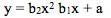 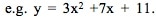 A 2nd order Polynomial has 1 change in direction. As x increases, y increases and then decreases (or y decreases and then increases). Two examples are pictured above. These shapes are Parabolas. A "3rd degree", aka "3rd order" aka Cubic" Polynomial has an x cubed term and changes direction twice. A kth degree Polynomial has k – 1 changes in direction. Simpler is better. It is usually not necessary to go beyond 3 orders. Larger orders are harder to work with. Also, they may be too closely associated with the idiosyncracies of the data provided in a particular Sample, and they may not be generally applicable to data in other Samples from the same Population or Process. Reproduced by permission of John Wiley and Sons, Inc
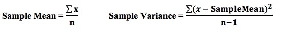
from the book, Statistics from A to Z -- Confusing Concepts Clarified A Statistic is a numerical property of a Sample, for example, the Sample Mean or Sample Variance. A Statistic is an estimate of the corresponding property (“Parameter”) in the Population or Process from which the Sample was drawn. Being an estimate, it will likely not have the exact same value as its corresponding population Parameter. The difference is the error in the estimation. So, if we calculate a Statistic entirely from data values, there is a certain amount of error. For example, the Sample Mean is calculated entirely from the values of the Sample data. It is the sum of all the data values in the Sample divided by the number, n, of items in the Sample. There is one source of error in its formula – the fact that it is an estimate because it does not use all the data in the Population or Process. 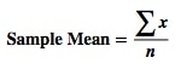 If we then use that Statistic to calculate another Statistic, it brings its own estimation error into the calculation of the second Statistic. This error is in addition to the second Statistic’s estimation error. This happens in the case of the Sample Variance. The numerator of the formula for Sample Variance includes the Sample Mean. It takes each data value (the x’s) in the Sample and subtracts from it the Sample Mean, squares it. Then it sums all those subtracted values. So, the Sample Variance has two sources of error:
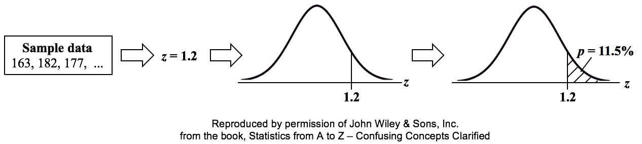
 That is why the Degrees of Freedom for the Chi Square Test for the Variance is n - 1. Subtracting 1 from the n in the denominator results in a larger value for the Variance. This addresses the two sources of error. Here are the formulas for Degrees of Freedom for some Statistics and tests: 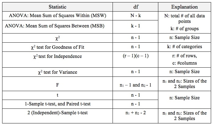 p is the Probability of an Alpha (False Positive) Error. Alpha (α) is the Level of Significance; its value is selected by the person performing the statistical test. If p < α (some say if p < α) then we Reject the Null Hypothesis. That is, we conclude that any difference, change, or effect observed in the Sample data is Statistically Significant. The p-value contains the same information as the Test Statistic Value, say z. That is because the value of z is used to determine the p-value. As shown in the following concept flow diagram,
 Similarly α contains the same information as the Critical Value. 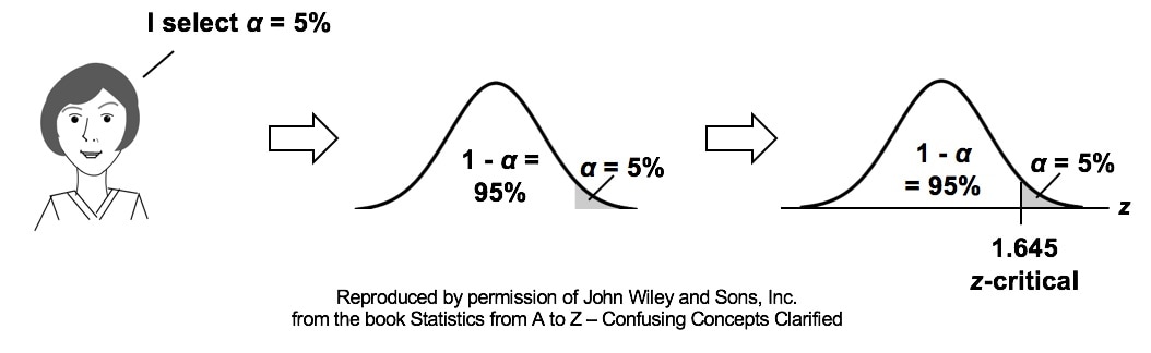 So comparing p and the Critical Value is the same as comparing Alpha and the Test Statistic value. But the comparison symbols ( ">" and "<") point in the opposite direction. That's because p and Test Statistic have an inverse relation. A smaller value for p means that the Test Statistic value must be larger. (See the blog post for March 30 of this year.) 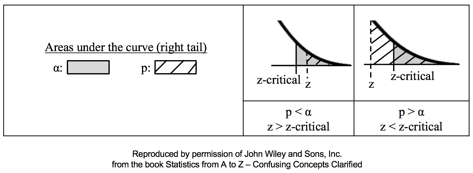 In last week's Tip of the Week, we said that a Histogram was good for picturing the shape of the data. What a Histogram is not good for is picturing Variation -- as measured by Standard Deviation or Variance. The size of the range for each bar is purely arbitrary. Larger ranges would make for fewer bars and a narrower picture. Also, the width of the bars in the picture can be varied, making the spread appear wider or narrower. A Dot Plot can be used to picture Variation if the number of data points is relatively small. Each individual point is shown as a dot, and you can show exactly how many go into each bin. 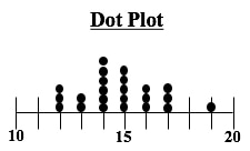 Boxplots, also known as Box and Whiskers Plots can very effectively provide a detailed picture of Variation. In our Nov. 10 2016 Tip of the Week, we showed how several Box and Whiskers Plots can enable you to visually choose the most effective of several treatments. Here's an illustration of the anatomy of a Box and Whiskers Plot 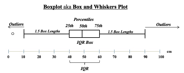 In the example above, the IQR box represents the InterQuartile Range, which is a useful measure of Variation. This plot shows us that 50% of the data points (those between the 25th and 75th Percentiles) were within the range of 40 – 60 centimeters. 25% were below 40 and 25% were above 60. The Median, denoted by the vertical line in the box is about 48 cm.
Any data point outside 1.5 box lengths from the box is called an Outlier. Here, the outlier with a value of 2 cm. is shown by a circle. Not shown above, but some plots define an Extreme Outlier as one that is more than 3 box lengths outside the box. Those can be shown by an asterisk. 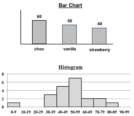 Both Bar Charts and Histograms use the height of bars (rectangles of the same width) to visually depict data. So, they look similar.
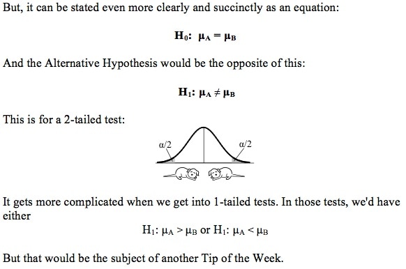
But, they
1. Separated or contiguous
2. Types of data
3. How Used
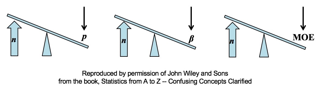 All other things being equal, an increase in Sample Size (n) reduces all types of Sampling Errors, including Alpha and Beta Errors and the Margin of Error.
A Sampling "Error" is not a mistake. It is simply the reduction in accuracy to be expected when one makes an estimate based on a portion – a Sample – of the data in Population or Process. There are several types of Sampling Error. Two types of Sampling Errors are described in terms of their Probabilities:
All three types of Sampling Error are reduced when the Sample Size is increased. This makes intuitive sense, because a very small Sample is more likely to not be a good representative of the properties of the larger Population or Process. But, the values of Statistics calculated from a much larger Sample are likely to be much closer to the values of the corresponding Population or Process Parameters. For more on p, see my video P, the p-value. In the future, there will also be videos on Alpha and Beta Error, the Margin of Error, and Confidence Intervals. You can subscribe to the channel to be notified. 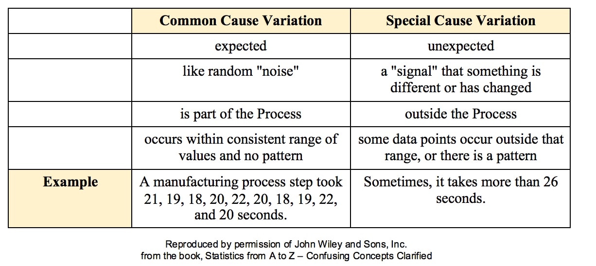 All processes have variation. A process can be said to be "under control", "stable", or "predictable" if the variation is
Such Variation is called Common Cause Variation; it is like random "noise" within an under-control process. Variation which is not Common Cause is called Special Cause Variation. It is a signal that factors outside the process are affecting it. Any Special Cause Variation must be eliminated before one can attempt to narrow the range of Common Cause Variation. Until we eliminate Special Cause Variation, we don't have a process that we can improve. There are factors outside the process which affect it, and that changes the actual process that is happening in ways that we don't know. Once we know that we have Special Cause Variation, we can use various Root Cause Analysis methods to identify the Special Cause, so that we can eliminate it. Only then can we use process/ quality improvement methods like Lean Six Sigma to try to reduce the Common Cause Variation. Here are some examples of Special Causes of Variation:
Here is an example of a Control Chart. Each point is the Mean of a small Sample of data. The Upper Control Limit (UCL) and the Lower Control Limit (LCL) are usually set at 3 Standard Deviations from the Center Line. 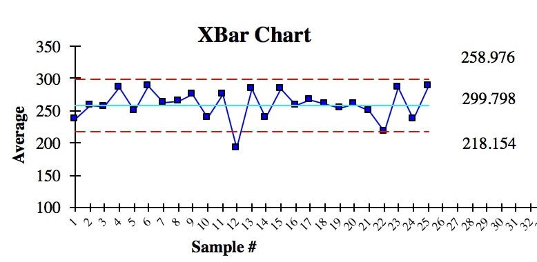 We see that there is one anomalous Sample Mean outside the Control Limits. This is due to Special Cause Variation. So, we need to do some root cause analysis to determine what caused that. And we need to make changes to eliminate it, before we can try to narrow the range of the Control Limits.
In addition to being within Control Chart limits, the data must be random. There are a number of Run Rules which describe patterns which are not random. Some patterns are not always easy to spot by eyeballing charts. Fortunately, the same software which produces Control Charts will usually also identify patterns described by the Run Rules. Here are some common patterns which indicate non-random (Special Cause) Variation. A Sigma is a Standard Deviation.
Reproduced by permission of John Wiley and Sons, Inc. from the book, Statistics from A to Z – Confusing Concepts Clarified 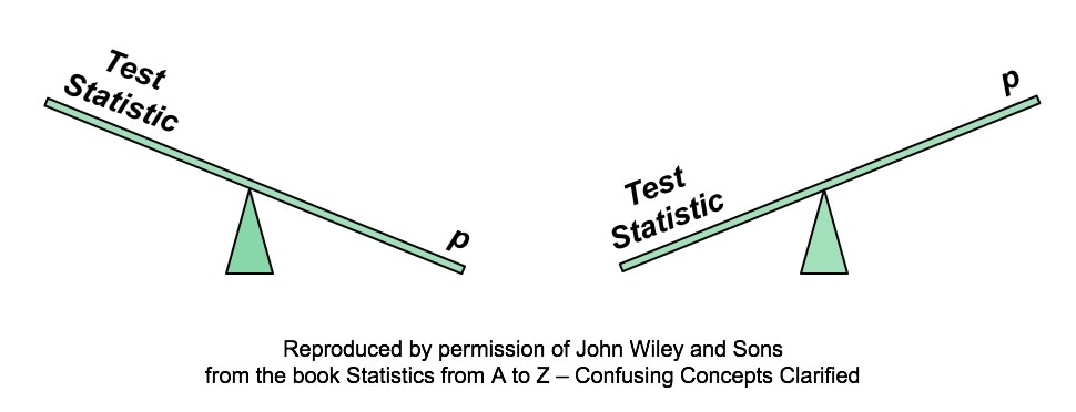 A larger Test Statistic value (such as that for z, t, F, or Chi-Square) results in a smaller p-value. The p-value is the Probability of an Alpha (False Positive) Error. And conversely, a smaller Test Statistic value results in a larger value for p. Here's how it works:
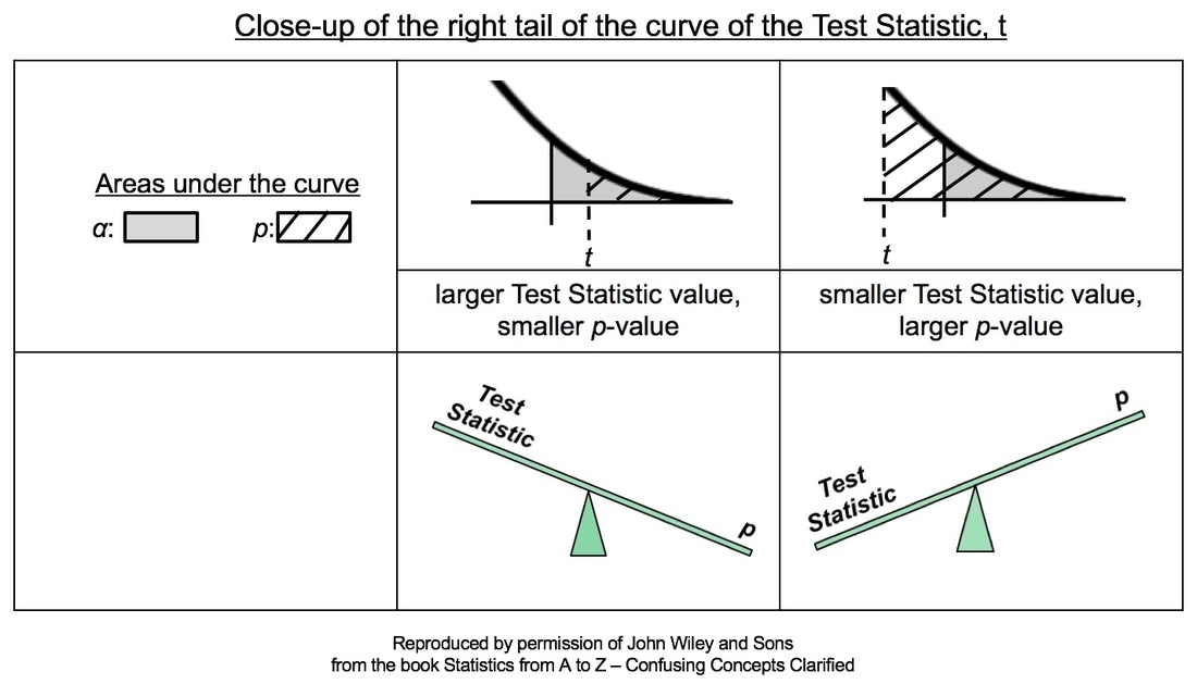 In the close-ups of the right tail, zero is not visible. It is at the center of the bell-shaped t curve, and it is out of the picture to the left. So, a larger value of the Test Statistic, t, would be farther to the right. And, the hatched area under the curve representing the p-value would be smaller. This is illustrated in the middle column of the table above.
Conversely, if the Test Statistic is smaller, then it's value is plotted more to the left, closer to zero. And so, the hatched area under the curve representing p would be larger. This is shown in the rightmost column of the table. For more on the concepts of Test Statistic and p-value, see my videos:
  |
AuthorAndrew A. (Andy) Jawlik is the author of the book, Statistics from A to Z -- Confusing Concepts Clarified, published by Wiley. Archives
March 2021
Categories |

 RSS Feed