|
In an earlier Tip, we said that a Histogram was good for picturing the shape of the data. What a Histogram is not good for is picturing Variation -- as measured by Standard Deviation or Variance. The size of the range for each bar is purely arbitrary. Larger ranges would make for fewer bars and a narrower picture. Also, the width of the bars in the picture can be varied, making the spread appear wider or narrower. A Dot Plot can be used to picture Variation if the number of data points is relatively small. Each individual point is shown as a dot, and you can show exactly how many go into each bin. 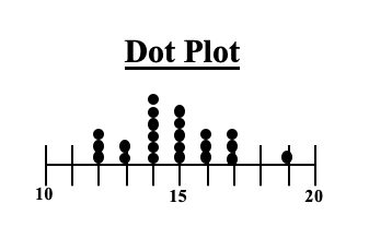 Boxplots, also known as Box and Whiskers Plots can very effectively provide a detailed picture of Variation. In an earlier Statistics Tip, we showed how several Box and Whiskers Plots can enable you to visually choose the most effective of several treatments. Here's an illustration of the anatomy of a Box and Whiskers Plot 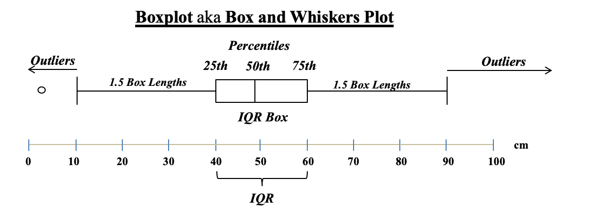 In the example above, the IQR box represents the InterQuartile Range, which is a useful measure of Variation. This plot shows us that 50% of the data points (those between the 25th and 75th Percentiles) were within the range of 40 – 60 centimeters. 25% were below 40 and 25% were above 60. The Median, denoted by the vertical line in the box is about 48 cm.
Any data point outside 1.5 box lengths from the box is called an Outlier. Here, the outlier with a value of 2 cm. is shown by a circle. Not shown above, but some plots define an Extreme Outlier as one that is more than 3 box lengths outside the box. Those can be shown by an asterisk
0 Comments
I just uploaded a new video to my channel on You Tube: Design of Experiments -- Part 1 of 3. 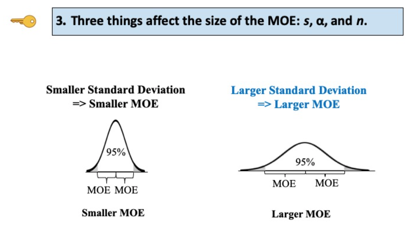 I just uploaded a new video to You Tube: Margin of Error. It's part of a playlist on Errors in Statistics.
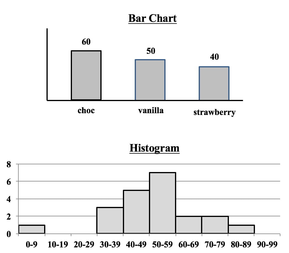 Both Bar Charts and Histograms use the height of bars (rectangles of the same width) to visually depict data. So, they look similar.
But, they
1. Separated or contiguous
2. Types of data
3. How Used
I just uploaded a new video: Alpha and Beta Errors. 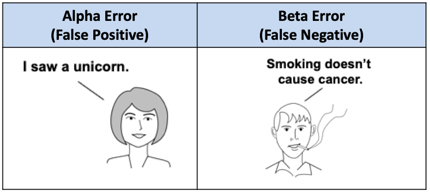 And previously, I had uploaded a video on Statistical Errors -- Types, Uses, and Interrelationships. 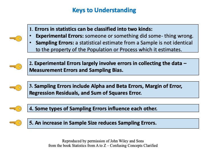 See the Videos page on this site for a list of my videos previously uploaded.
All other things being equal, an increase in Sample Size (n) reduces all types of Sampling Errors, including Alpha and Beta Errors and the Margin of Error. 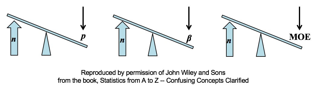 A Sampling "Error" is not a mistake. It is simply the reduction in accuracy to be expected when one makes an estimate based on a portion – a Sample – of the data in Population or Process. There are several types of Sampling Error.
Two types of Sampling Errors are described in terms of their Probabilities:
All three types of Sampling Error are reduced when the Sample Size is increased. This makes intuitive sense, because a very small Sample is more likely to not be a good representative of the properties of the larger Population or Process. But, the values of Statistics calculated from a much larger Sample are likely to be much closer to the values of the corresponding Population or Process Parameters For more on the statistical concepts mentioned here (p, β, MOE, Confidence Intervals, Statistical Errors, Samples and Sampling), please see my book or my YouTube channel -- both are titled Statistics from A to Z -- Confusing Concepts Clarified. 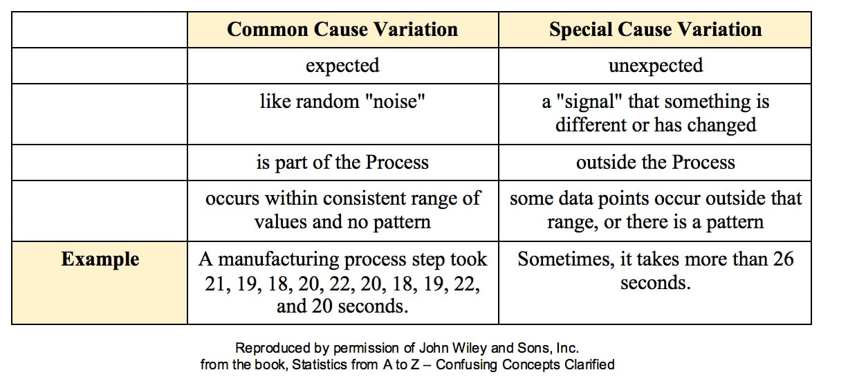 All processes have variation. A process can be said to be "under control", "stable", or "predictable" if the variation is
Such Variation is called Common Cause Variation; it is like random "noise" within an under-control process. Variation which is not Common Cause is called Special Cause Variation. It is a signal that factors outside the process are affecting it. Any Special Cause Variation must be eliminated before one can attempt to narrow the range of Common Cause Variation. Until we eliminate Special Cause Variation, we don't have a process that we can improve. There are factors outside the process which affect it, and that changes the actual process that is happening in ways that we don't know. Once we know that we have Special Cause Variation, we can use various Root Cause Analysis methods to identify the Special Cause, so that we can eliminate it. Only then can we use process/ quality improvement methods like Lean Six Sigma to try to reduce the Common Cause Variation. Here are some examples of Special Causes of Variation:
Here is an example of a Control Chart. Each point is the Mean of a small Sample of data. The Upper Control Limit (UCL) and the Lower Control Limit (LCL) are usually set at 3 Standard Deviations from the Center Line. 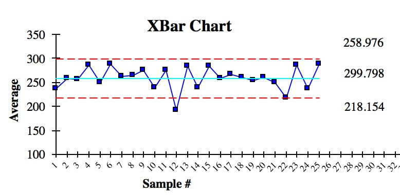 We see that there is one anomalous Sample Mean outside the Control Limits. This is due to Special Cause Variation. So, we need to do some root cause analysis to determine what caused that. And we need to make changes to eliminate it, before we can try to narrow the range of the Control Limits.
In addition to being within Control Chart limits, the data must be random. There are a number of Run Rules which describe patterns which are not random. Some patterns are not always easy to spot by eyeballing charts. Fortunately, the same software which produces Control Charts will usually also identify patterns described by the Run Rules. Here are some common patterns which indicate non-random (Special Cause) Variation. A Sigma is a Standard Deviation.
Reproduced by permission of John Wiley and Sons, Inc. from the book, Statistics from A to Z – Confusing Concepts Clarified I just uploaded a new video:
 And, oops, it looks like I missed announcing on this blog the two videos before that:
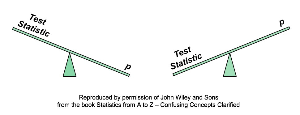 A larger Test Statistic value (such as that for z, t, F, or Chi-Square) results in a smaller p-value. The p-value is the Probability of an Alpha (False Positive) Error. And conversely, a smaller Test Statistic value results in a larger value for p. Here's how it works:
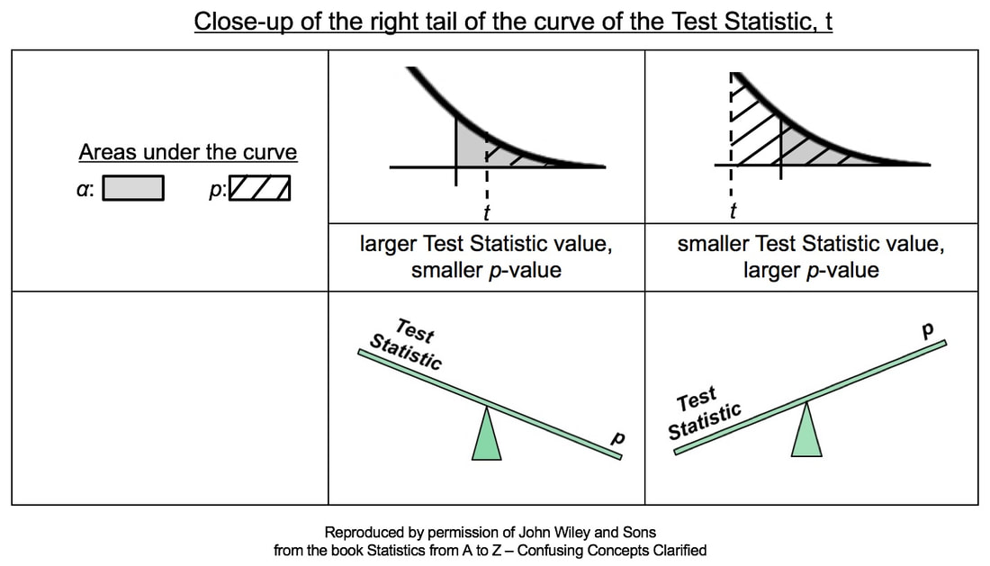 In the close-ups of the right tail, zero is not visible. It is the center of the bell-shaped t curve, and it is out of the picture to the left. So, a larger value of the Test Statistic, t, would be farther to the right. And, the hatched area under the curve representing the p-value would be smaller. This is illustrated in the middle column of the table above.
Conversely, if the Test Statistic is smaller, then it's value is plotted more to the left, closer to zero. And so, the hatched area under the curve representing p would be larger. This is shown in the rightmost column of the table. Statistics Tip: In a 1-tailed test, the Alternative Hypothesis points in the direction of the tail1/2/2020 In the previous Tip, , we showed how to state the Null Hypothesis as an equation (e.g. H0: μΑ = μΒ). And the Alternative Hypothesis would be the opposite of that (HA: μA ≠ μB). These would work for a 2-tailed (2-sided) tests, when we only want to know whether there is a (Statistically Significant) difference between the two Means, not which one may be bigger than the other. But what about when we do care about the direction of the difference? This would be a 1-tailed (1-sided) test. And the Alternative Hypothesis will tell us whether it's right-tailed or left-tailed. (We need to specify the tail for our statistical calculator or software.) How does this work? First of all, it's helpful to know that the Alternative Hypothesis is also known as the "Maintained Hypothesis". The Alternative Hypothesis is the Hypothesis which we are maintaining and would like to prove. For example, We maintain that the Mean lifetime of the lightbulbs we manufacture is more than 1,300 hours. That is, we maintain that µ > 1,300. This, then becomes our Alternative Hypothesis. HA: µ > 1,300 Note that the comparison symbol of HA points to the right. So, this test is right-tailed. If, on the other hand, we maintained that the Mean defect rate of a new process is less than the Mean defect rate of the old process, our Maintained/ Alternative Hypothesis would be HA: µ New < µ Old and the test would be left-tailed. 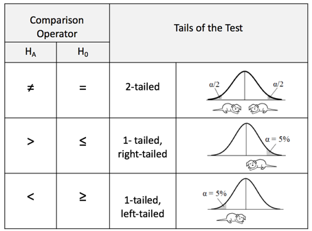 |
AuthorAndrew A. (Andy) Jawlik is the author of the book, Statistics from A to Z -- Confusing Concepts Clarified, published by Wiley. Archives
March 2021
Categories |

 RSS Feed